capture one

Overcoming Challenges to Create a Clean, Descriptive Image of a Tight Space

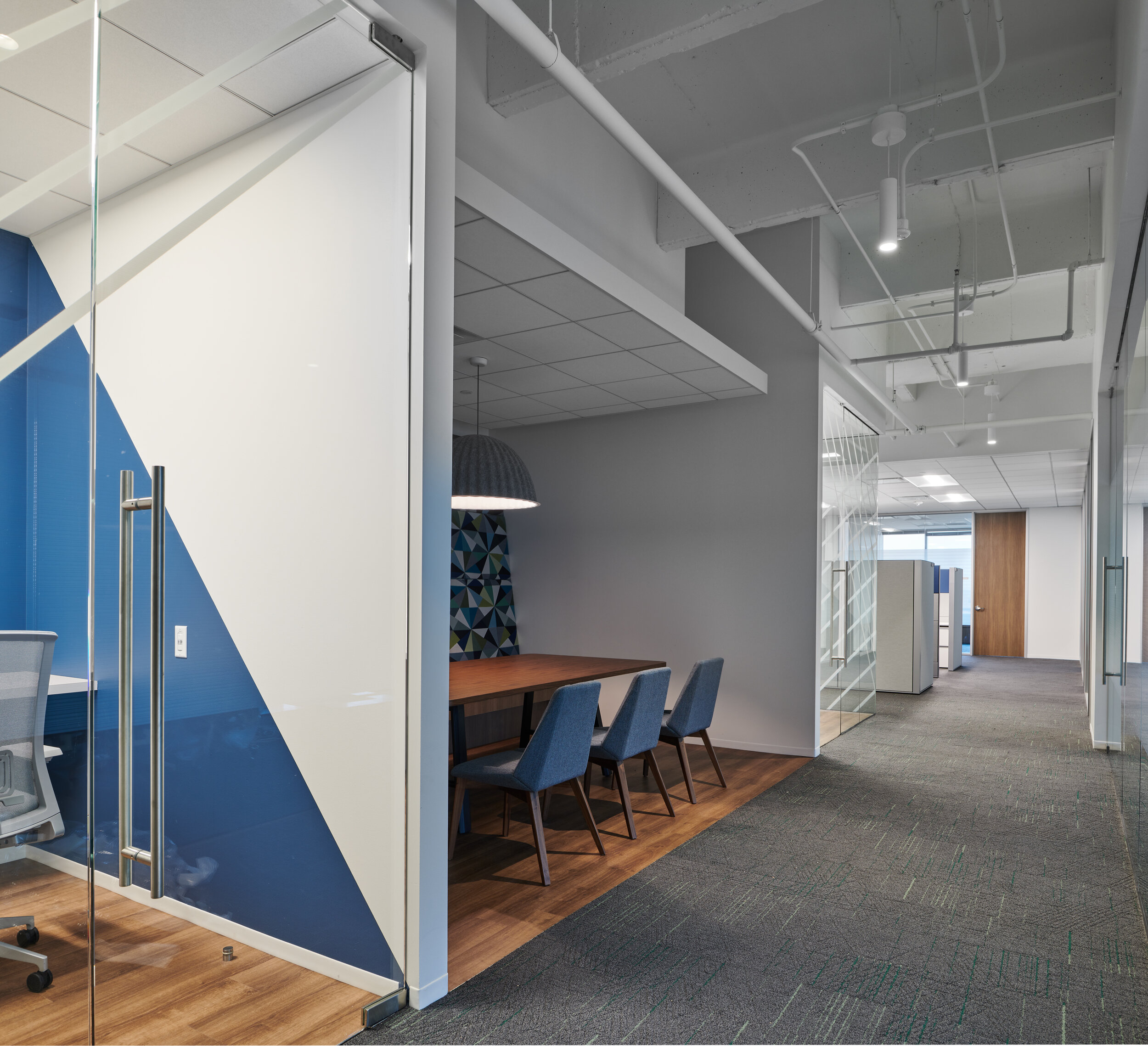
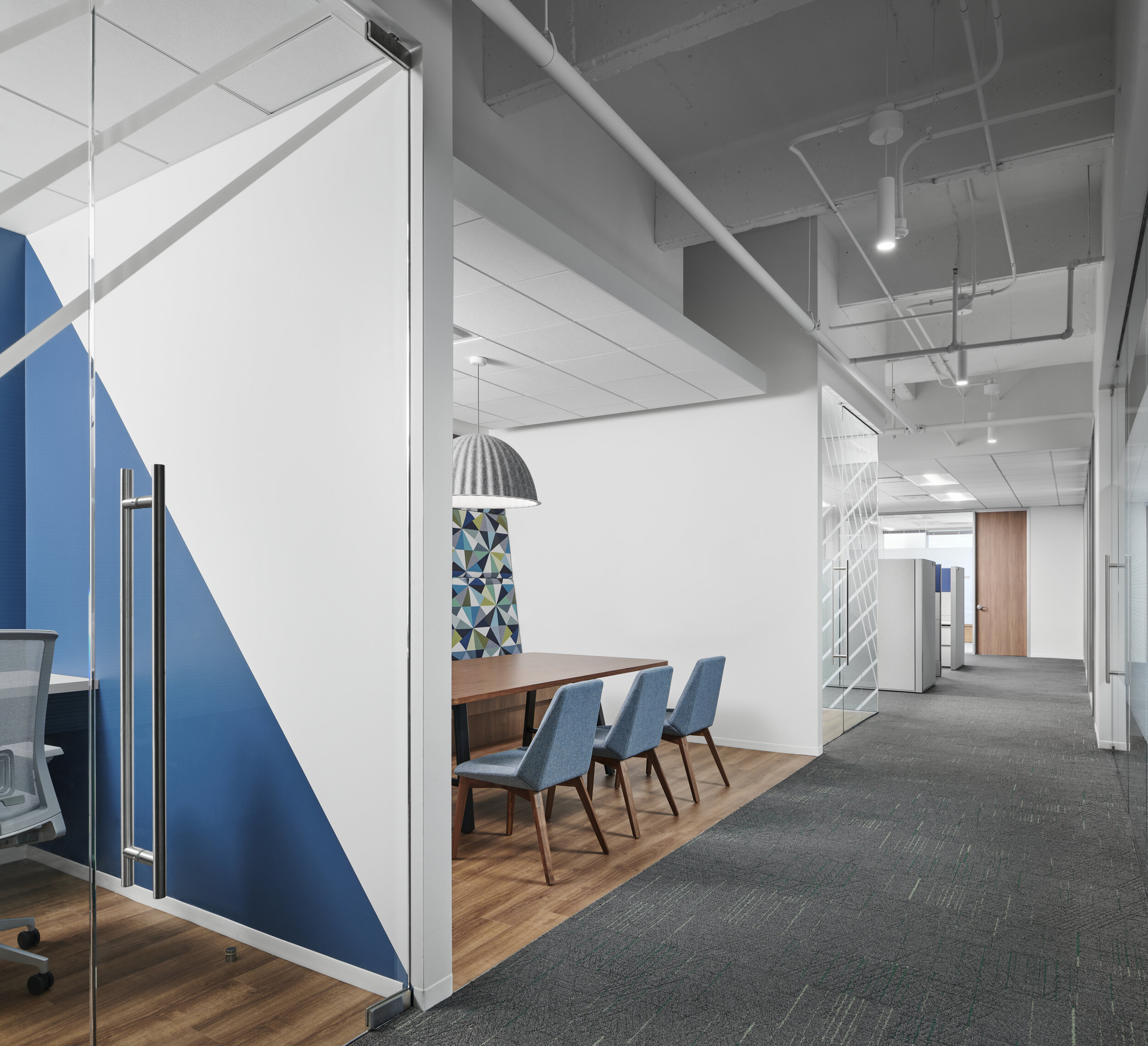
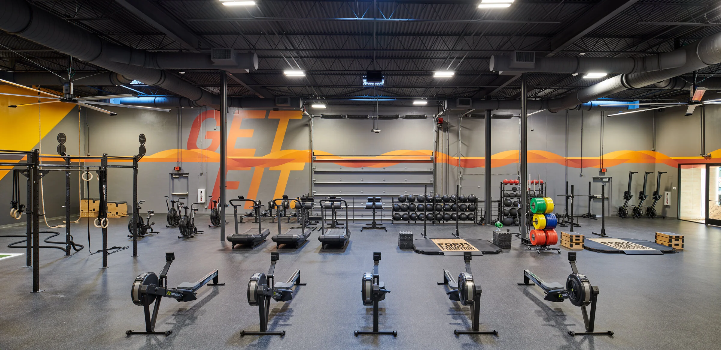
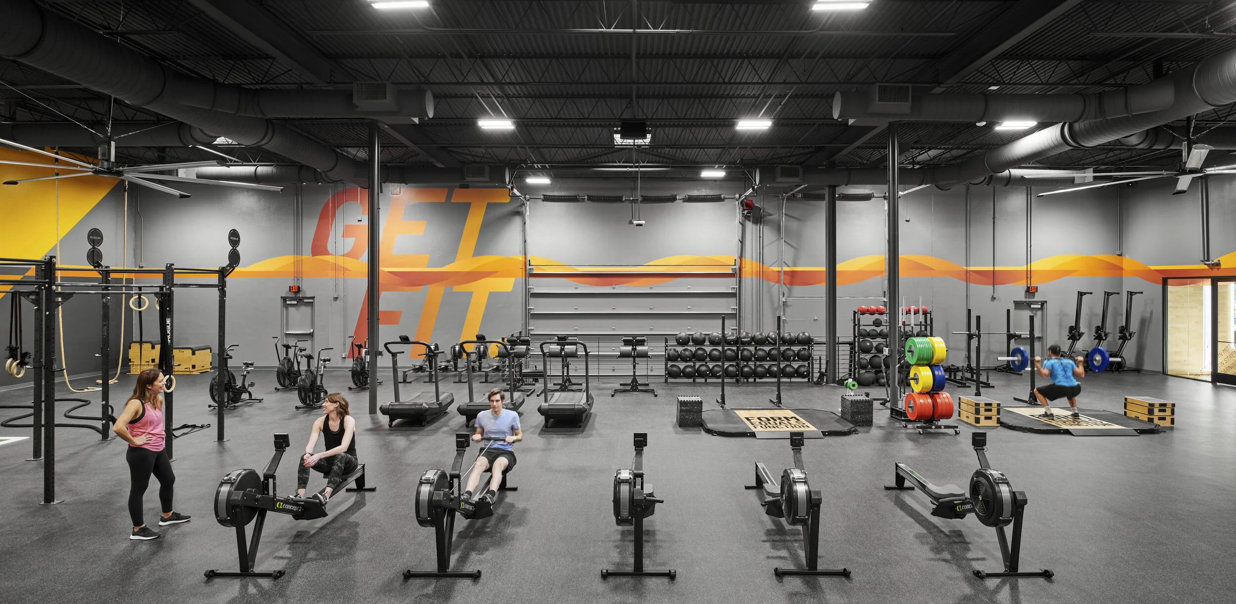
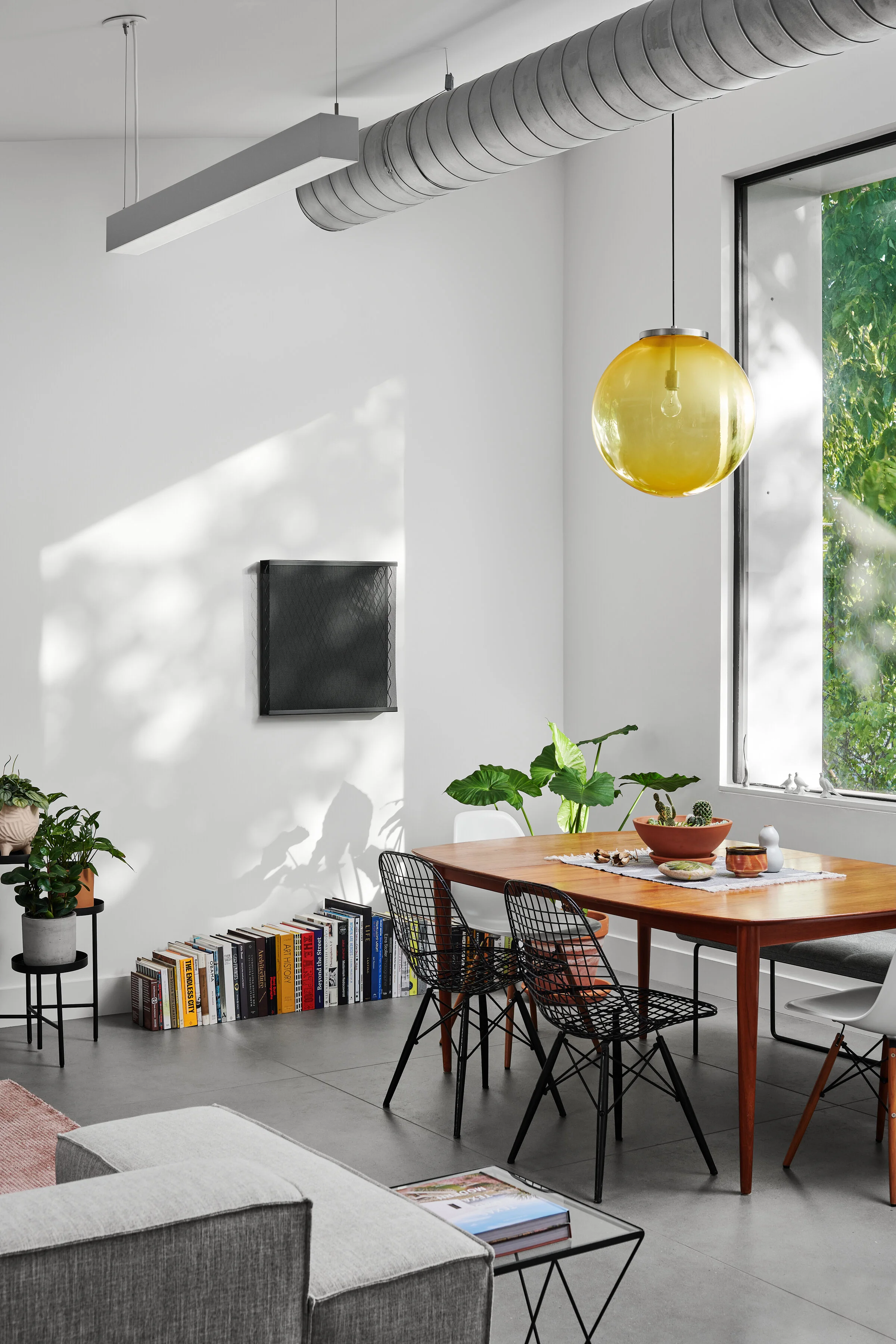
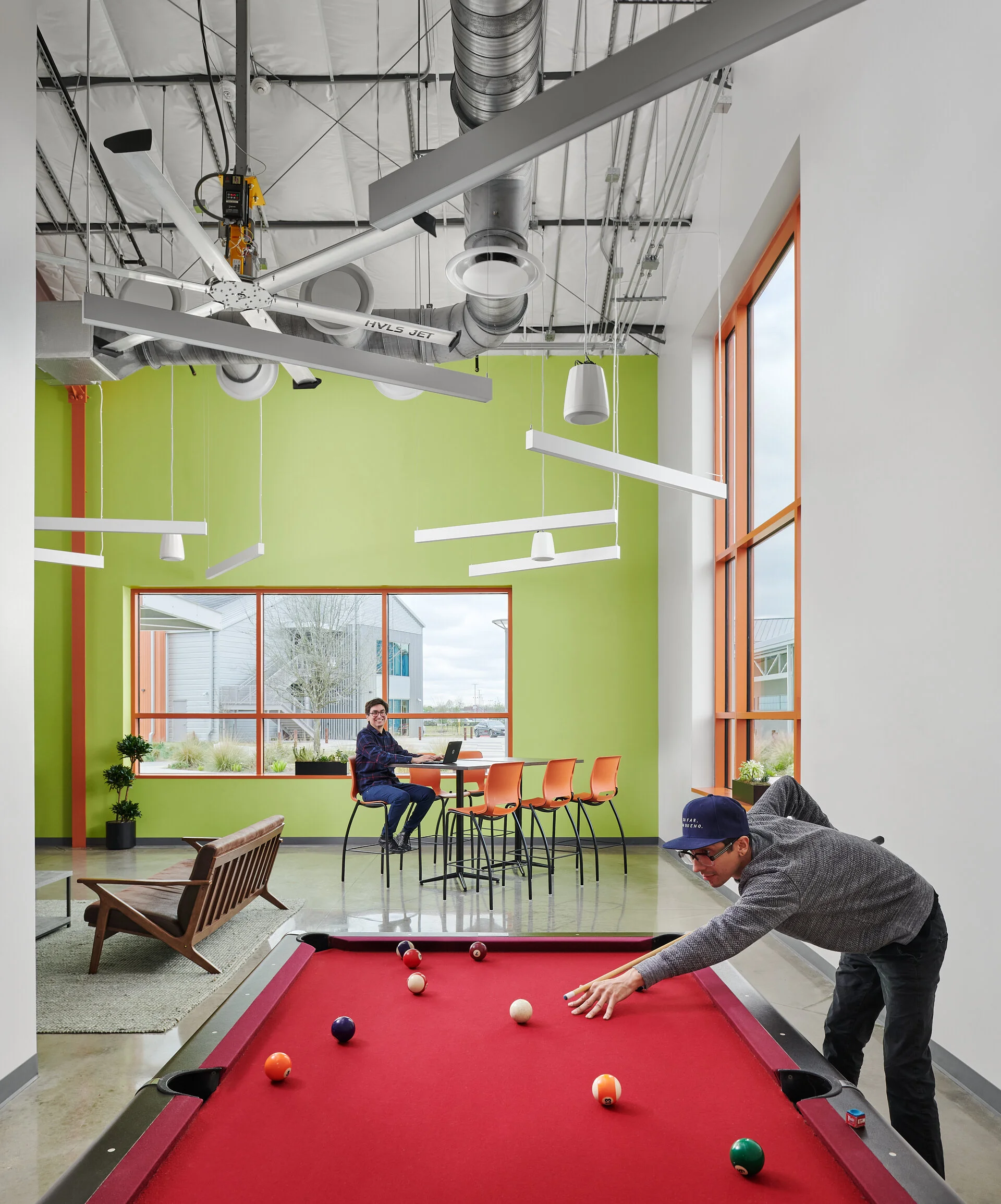
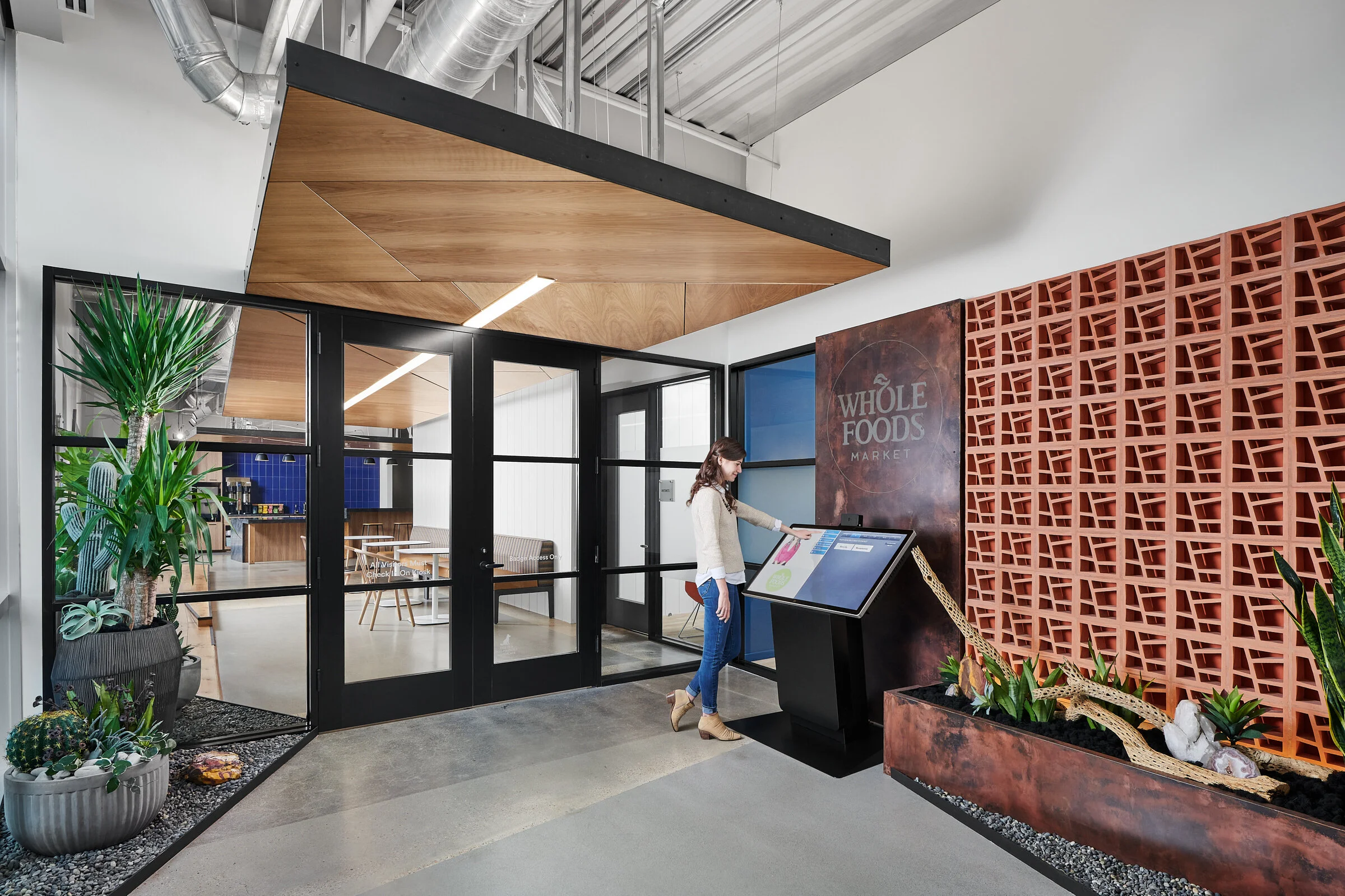
Every composition when shooting workplace interiors comes with a unique set of challenges. Reflections, varying color levels and temperatures, malfunctioning building systems and more are often things we have to overcome in order to convey the overall design intent and vision. In the image below, we were tasked with showing a fairly complex space located at the end of an office space that contains a variety of spaces - two phone rooms, an open breakout space, work stations, offices and an adjacent conference room - WHEW. To make things even more tricky, lighting levels between the spaces were very inconsistent, particularly the central breakout space which was only lit with one large pendant, making it appear quite dark in an image with available light compared to the corridor and adjacent rooms. And on top of everything, I wanted to capture all of these spaces in one image in order to show their connectivity, so opted to do a vertical stitch using my 24mm tilt shift lens to help illustrate the open ceiling of the corridor.

When approaching a shot like this that joins multiple spaces which all could benefit from supplemental lighting, my instinct is generally to treat them individually, with an overall plan to combine them strategically in post. To begin with this strategy, I first run through a round over ambient frames in order to capture things as they are. From here we begin shooting each individual space with supplemental lighting at a fast enough shutter speed to regulate any ambient light that we could not control. Once this has all been captured, all that’s left to do is to jump into the computer to piece it all together, which is where the video below picks up.

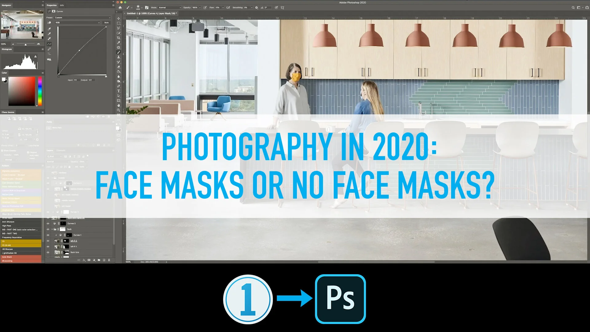
As with most of my interiors shots created in this way, I first run through some quick RAW processing in Capture One to get each frame that will be used dialed in at the levels and white balance that I want including one frame specifically for the ceiling information which I spend a little more time on ensuring that the white ceiling doesn’t have any color contamination. From here I move into Photoshop, run a script I’ve got to auto merge and align the images, and can begin the exposure blending, color corrections and retouching. Since beginning to share these processing videos, I am frequently asked about the time it takes to do this work in post and the value of it. This image took 50 minutes from start to finish in the computer. As for the value, all I can say is that with time, I feel that I have become very efficient in the way I go about both my post-processing and shooting on site and think that with some practice, these things can take far less time than they may first appear. Workplace interiors and similar spaces are inherently challenging ones to photograph, but the reward of providing clients with images that convey their designs as cleanly and straight forward as possible is invaluable.

How to Create Differing Views of a Multi-function Space as Efficiently as Possible

A common practice in architecture and interior design is for design teams to create spaces that can serve various functions depending on the occupants needs. As photographers of these spaces, we are often asked to show this flexibility images that illustrate multiple arrangements within. In years past, I would go about this by creating these images one after another from scratch, resulting in the capturing, lighting and assembling them each as singular images. With some practice I was able to develop a technique that allows the creation of these views as efficiently as possible by treating the first overall image as the base, and replacing only the altered portion of the scene as needed. Though this likely seems logical upon reading, I’ve found that it helps to hear someone talk through their thinking and process before it clicks in my head and changes the way that I organize myself during a shoot and in post-production to have as efficient a workflow as possible.

In the example shown, we are standing in the lobby of an Austin Law Office designed by Perkins + Will and are looking down a corridor separating a large board room on the right hand side and a series of meeting spaces on the left. These spaces on the left are designed with moveable partitions separating each of them to allow the occupants to expand or contract their capacity as needed. To begin, we kept the partitions closed and simulated a meeting in the visible meeting room, showing it as it would most often be used. Once we completed the photography of this overall scene, we then decided to show an alternate version with a person setting up the space to be a larger meeting area, while also showing them moving the partitions to illustrate the technology used in their design (this has an added benefit of not having to completely rearrange the space to accommodate a larger group). Once we established this alternate scenario, all we had to do was focus on that particular part of the image while shooting, knowing that we would be able to insert it quickly and efficiently in our post-production workflow. In this case, we chose to keep the model on the right as is for both images, with the thinking that the images won’t be shown side by side on a website or in print, but most likely just in presentations to clients to illustrate the moveable partitions creating a flexible space.

I have found this method useful in a variety of scenarios, including shooting a space with a closed and opened door giving a view into the function beyond, flexible furniture solutions (i.e. sit/stand desks), variations on people using a space, exterior views with moveable walls allowing for an indoor/outdoor connection, etc.

P+W_Shearman and Sterling_003_3.jpg
P+W_Shearman and Sterling_003_v4.jpg

Utilizing Capture One's Powerful Color Tools to Achieve Accurate Colors of a Space

To the casual reader of this blog (if that exists), you may question why color corrections take up so much of the information discussed when describing the process of creating an accurate and pleasing architectural image. For those of us in the industry, producing accurate colors to represent a space as honestly and straight forward as possible is one of the most challenging parts of the job. In many of my past posts discussing this process, I often employ a mixture of artificial lighting (flash) and saturation control in Photoshop. With larger spaces, we are often at the mercy of the lighting conditions of the spaces we are shooting and very frequently, the mixed lighting conditions in the built environment don’t initially translate well to digital images. The reason for this is that every light source has a varying temperature and when mixed, surfaces take on these temperatures often creating mixed results that are distracting and unpleasing to the eye. Generally this is not something that our eyes register when we are experiencing a place in person, but when capture in a still image, this can often make or break the feeling we get from them. In addition to these varying light sources, another major consideration of how light interacts within a space is the sorts of treatments of color within and how light may bounce off of that to affect the surrounding area.

All of these factors are at play in the example below, an image recently created with Perkins + Will in Dallas of their ParkerFit project at Parker University. ParkerFit is a large fitness facility in a revamped warehouse designed to have bold infographics wrapping around its perimeter to encourage movement and activate the space. On one wall, there is a floor to ceiling graphic with the facilities name embedded within, and on others, catch phrases and motivational texts stream across. Lighting wise, the space is lit both by an array of skylights, operable overhead doors and large, warm light fixtures to create a bright, comfortable environment to workout in. For a photographer, it is this combination of factors along with the dark interior finishes that create a particular challenge. From above and at points within the perimeter where the overhead doors exist, we have natural light that streams in with a blue light from the reflected sky. The lighting within is comprised of very warm practical lighting which produce a light several thousand kelvin off from the natural lighting. And to top everything off, the yellow and orange supergraphics are reflected on to all surfaces, creating a very challenging color palette with which to create a clean image that accurately describes the space and materials within.

To process this set of images in order to achieve the look I desired, I relied heavily on Capture One’s very powerful Color Editor tools while working through the RAW conversion before sending them into Photoshop for final retouching and color work. With the inclusion of adjustment layers several versions ago, Capture One opened up the opportunity to create very refined results within our RAW editing software that can be achieved very efficiently. In the video below, I share my process as I work through one of our overall hero shots of the space.

Before color corrections

Before color corrections

Final image after color corrections

Final image after color corrections

Piecing Together a Complex Multi-Layered Interior Space

In workplace design, there are some spaces that are just inherently difficult to capture cleanly no matter how you approach them. That was the case with this space at the Khoros office designed by Austin’s Urban Foundry Architecture, where they created a dynamic work environment with multiple breakout and collaboration spaces mixed in with the workstations themselves. These spaces were given separation through the implementation of screen walls which help visibly and physically divide the functions, but while doing so, make a particular challenge for us photographers. To add to the challenge, this shot in particular was created towards the end of a very full day of interiors, which led to our pushing through the photography as quickly and efficiently as possible. After coming up with a comfortable way of arranging the existing furnishings to our selected composition, we proceeded to capture a variety of flash frames attempting to isolate varying sections of the space in a way that made sense to me when thinking down the line of how I would approach the compositing in post-production. This led to thinking of the space as a foreground, divided into two - left and right, a middle ground, and the remaining background information. The lighting within the space was very challenging, so choosing to light the majority of the two nearer spaces with supplemental lighting was a no brainer, but the nature of the screen walls meant that this would be quite the challenge once back to the computer.

In this video, you will see as I struggle through piecing all of these sections together to create a clear image that describes the spaces and their connections well.

UFARC_Khoros_011_v1.jpg

Architectural Photography in 2020: Face Masks or No Face Masks?

As many of us find ourselves returning to photographing projects after several months of limited work, the most common consideration of the times when working out the logistics of shooting spaces in these unprecedented times is whether to depict models/people within the spaces wearing masks or not. Even well before we returned to shooting, I was having conversations with several clients discussing what photography would look like when we were able to safely return to it and most specifically, how do we think about the treatment of our new normal of wearing face masks in shared spaces. Early on, many of us felt that it would likely feel reactionary to photograph people wearing masks when creating imagery for a project that will be used long after the pandemic is over. As things have evolved and we continue to see rising numbers and no end in sight for the near future, I have experienced a variety of viewpoints on the subject as we all work through how to best depict projects in the current times.

The answer to this question may be largely dependent on project type. For civic, cultural, education and public spaces, I think that it can make sense to show people as they are (or would be, if spaces are not opened) in the moment, giving the images and honest, journalistic quality. I have heard from designers of these types of projects and their PR teams, that it may be particularly desirable if there are plans for the work to be published in the near term. Workplaces, retail, restaurants and hotels on the other hand may not have an immediate benefit or obvious use for showing people masks and images of those spaces with masked subjects may lose their usefulness over time as we move past the current situation. Many design teams recently have been opting to have us capture a few images in the set featuring people both wearing and not wearing face masks in order to have the option for the immediate use, but also having the ability to use the unmasked photos with more flexibility down the line. This is the case with the image shown in this video that was created recently in collaboration with the design team at Perkins + Will Dallas of an office for a health care company.

This question is just one of several floating around our industry these days as we all adapt to the current situation and return (at varying frequency), to work. Others include what project types are appropriate to photograph. Education projects have been pushed back because as campuses are empty, how do we consider documenting the spaces in an era of architectural photography where it’s common and desirable to show people using a space. Workplaces, office buildings, and other commercial spaces have incorporated significant efforts in signage and restrictions on usable spaces, requiring us to often have to adapt on the fly as we enter a space that may not be quite as expected or that poses significant challenges when trying to photograph them free of clutter that take away from the original design intent. Many firms are reprioritizing their strategies for photography to fit with what makes the most sense to photograph in a time of limited occupancy and sensitivity to the unknown future of certain project types.

What are you experiencing in the sectors that you work in? How do you feel we should be portraying these spaces and the people within?

P+W_Signify Health_003_v1.jpg

Photographing and Post-Processing an Interior Vignette - Pandemic Edition

Whew. Well, kudos to anyone who made it all the way through part two of this video series, where I walk through the photography and post-processing of the image below. The original plan was to share the editing process in real-time, but I quickly recognized how boring that would be to sit through as I fumbled my way through describing my every move as I made them (turns out that’s not so easy). So I hope to have found a happy medium with this final result where I speed up the screen recording and talk over top of it.

Post-production has always had a huge impact on the final outcome of a photograph. Whether it be dodging, burning and other techniques in the darkroom or complex compositing that some of us employ digitally today. There are endless debates out there on how much is too much, and I’ll leave that for another discussion. The ability to manipulate color, tonality and light is limitless with todays technology and many of us utilize these tools to create the images that we think are most fitting for a clients needs and show the true essence of their design intent.

There are a few noteworthy things about how I went about shooting this space. First of all, by controlling the amount of natural light that is allowed into the frame by flagging (blocking) off the two smaller windows to the cameras left, we can already achieve a very nice shaping of light within the space. In the ambient frame shown below, we can begin to see how that natural light fills the space, but also begin to see the problems that arise from such a large window which introduces a variety of color casts from the trees and sky outside on to the walls and other surfaces. We are also not able to define both the interior and exterior’s exposures correctly in one single shot as our eyes are able to perceive, which is where using strobes becomes such a powerful tool. As you can see in the flash frame below, this already gets us 80% to the final result. By utilizing Photoshop to merge these and a few other frames, we are able to seamlessly blend exposures to come up with a crisp, natural looking result that is true to the spaces finishes and likeness.

On the right, an ambient frame of the space using only natural light. Notice the strong colors being cast onto the surfaces from the foliage inside and out and the blues of the sky.  On the left, a single exposure with flash allows us to balance the…

On the right, an ambient frame of the space using only natural light. Notice the strong colors being cast onto the surfaces from the foliage inside and out and the blues of the sky.
On the left, a single exposure with flash allows us to balance the interior and exterior much better, while being true to the material pallet inside of the space.

Once I found the balance I was looking for in the flash and ambient exposures, I moved the files into the computer where I dove into the RAW conversion, which involves basic adjustments to contrast, white balance and clarity and from there, send the files into Photoshop for compositing. This process for this image is fairly simple (all things considered) as it frequently is with interior vignettes because we are not trying to capture the entirety of a space which can often involve many more challenges such as those introduced when trying to light a much larger area. There are a few tools that you’ll see I lean on heavily when doing work in Photoshop, and those include layer masks, the pen tool, adjustment layers and cloning/healing. Instead of going deep into the details of those here, I will begin to think about separate videos I can create in the future that walk through my use of them more thoroughly.

With time, you begin to develop a general set of methods that you use to put your images together and will be able to always have these in the back of your mind as you’re shooting a project to ensure that you’ve got everything you need to come to the desired result.

LR_Vignette_03 1.jpg

Behind the Scenes: Post-Production with Perkins+Will of their recently completed ShareNow office project in Austin

Austin has proven to be an ideal location for tech companies to office, whether it be as their main headquarters or as a regional location. As a result, there has been a drive to create fun and dynamic work spaces in the area that foster creativity, flexibility and fun for the companies employees and it has been a pleasure to be a part of showcasing many of them.

One of the last projects we shot in 2019 was this great space in East Austin designed by the local Perkins+Will office for their client, ShareNow. ShareNow (formerly Car2Go) has located their new offices right in the thick of East Austin, a thriving neighborhood that encompasses much of what Austin is all about just minutes away from Downtown. The office features a variety of dynamic spaces, but none more fun than this employee lounge, featuring some beautiful furnishings and a balcony overlooking East 6th Street.

When we arrived at the project, there was a beautiful mid-morning light streaming into the space, so we knew that we had to start with this shot first, leaving us to scramble a bit to fine tune the staging of all the furniture and related objects. In this case, because the office was still fairly new, this also sent several of the design team members scrambling throughout the space to collect a few additional objects from around the office in order to help populate the shelves in our view. While they focussed on those items, my assistant and I focussed on the big picture items such as the placement of furniture and rugs, and how everything related to one another. Lighting wise, we added some touches of lights to help shape the furniture and large light fixtures as well as clean up the color of the ceiling and other warm finishes. The end result shows a bright, inviting area for employees to have a break from their day, change work environments, have informal meetings and more.

Lastly, in this video I touch on what’s coming next on the YouTube channel, which will feature a behind the scenes look at the composition, staging, photography and post-processing of an interior vignette that I’ll be doing from my home during the stay-at-home orders put in place under the current circumstances.

Behind the Scenes: Post-Production with Page of their recently completed Baker Ripley East Aldine Campus Project

Page’s Houston office recently completed a very engaging campus project for Baker Ripley’s East Aldine location. The project includes many unique spaces intended to help the surrounding community with support facilities for projects and businesses that members may otherwise not have access to including a fab lab (think makers space), commercial kitchen and much more.

For the second video in my YouTube series, I thought I would share a technique that many architectural photographer’s employ, which is the stitch panoramic. A stitch pano is a way to create a larger viewing area than available from a particular focal length by combining different frames using the movements that are possible with either a technical camera or tilt-shift lenses on a DSLR. One challenging part of employing this technique that those of us who are using a DSLR with tilt-shift lenses experience is a slight misalignment of those frames due to parallax which results from the movements happening in the lens while the sensor remains in one place. With technical cameras you are able to shift the sensor around while the glass remains in the same place, allowing for much simpler aligning. I mention this because some people will likely notice this slight discrepancy in the video, which I later went back and corrected for the final image.

This image was created in order to show a community room and its relationship with a couple of the other buildings on the campus and the courtyard that separates them. The space had great, large windows that provided lovely natural light. We aimed to emphasize the natural light a bit with the use of strobes while also cleaning up some of the color cast. Adding a couple of models (which included one of the designer’s from Page and the expert billiards hand of my asssistant, Spencer Young) provides a sense of scale and more emphasis on the spaces functions. The room was a little cluttered from daily use when we arrived, so we spent a fair amount of time clearing some unwanted items out and getting things just how we wanted them for the image. Staging also meant getting the pool table just where we wanted it so it would anchor this one point perspective, creating some symmetry in an otherwise asymmetrical space.

Page_Baker Ripley_013_v1 1.jpg

Introducing Our New YouTube Channel!

For some time now, I’ve been sharing some timelapses of my post-production process on Instagram as a way to share a peak behind the scenes at what my process looks like after a shoot has been completed and moves into the computer. As camera technology has evolved, so too have the techniques that many of use to create the final product that the world sees. Throughout the development of my career, I have benefited greatly from other photographers willingness to share their techniques and processes, whether it be through online tutorials, informal conversations or working together in person via workshops or assisting. I am creating this channel as an outlet to give a little more insight into my own process in effort to help other photographers who may find it useful and also to allow those outside of our industry to see some of what is often a largely hidden aspect of our job, despite being crucial to creating our end product. Outlets such as online forums, in person meetups and social media platforms like Instagram have allowed architectural and interior photographers to be connected like never before and I continue to be amazed at the camaraderie we have developed across the globe that offers tons of encouragement and ways to evolve within our business. Hopefully this channel can help to add to that sense of community and openness in some small way.

For this first video, the image is of an entry vestibule of the new Whole Foods offices in Austin, Texas designed by IA Interior Architects. The space was very tight, resulting in a rare interior shot using a very wide angle in order to capture the important elements of the design that myself and the design team wanted to showcase. The scene has several challenging aspects to it that anyone who photographs commercial interiors will be very familiar with including challenging reflections, several interconnected spaces, varying light sources and of course, those pesky exit signs. As far as staging and preparation goes, the shot was fairly simple, requiring only minimal staging of the furnishings in the main break area beyond the glass doors and a chair in the phone room. Since most of the items in the lobby are relatively fixed, we just had to tweak a few things so they looked right in camera and then were off to the races to capture the space.

Since this is the first video in the series, I thought I would give a little insight on the process we use when we’re on set in order to answer some questions that I’m sure will come up. Generally speaking, when approaching a commercial interior space, the first thing we do after identifying the angle that best describes a space we are capturing is to stage any existing or temporary furniture and objects so they look best in camera. This can often be meticulous work and requires an understanding of how objects relate to one another and how people might interact with them in an image while not causing distractions or clutter. Once this is complete, we will run through a series of frames using ambient light, sometimes employing techniques to control the available light so that we can get the best result. After that is when we’ll usually bring in artificial lighting if needed to clean up unwanted color casts, better shape objects and sometimes create daylight when it’s not there. The next and last step is to bring in models when they are being used, which is a great way to give a space some life while also showing the scale and intended use. With this and subsequent videos, I hope to shed some light on how I then bring all of these pieces together to create a final image. For a little more insight on my process, visit my interview with Veeral Patel with AP Almanac.