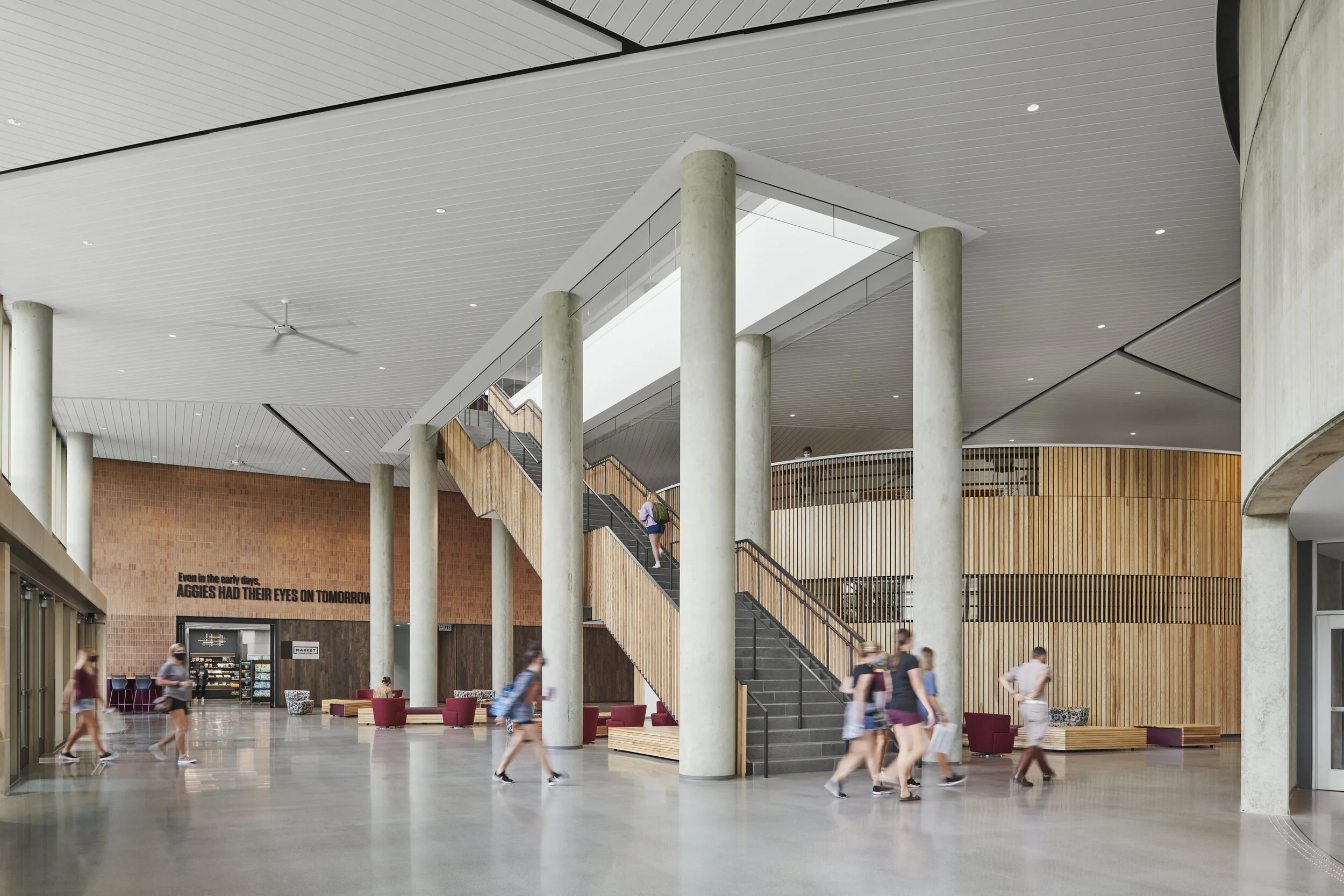
To the casual reader of this blog (if that exists), you may question why color corrections take up so much of the information discussed when describing the process of creating an accurate and pleasing architectural image. For those of us in the industry, producing accurate colors to represent a space as honestly and straight forward as possible is one of the most challenging parts of the job. In many of my past posts discussing this process, I often employ a mixture of artificial lighting (flash) and saturation control in Photoshop. With larger spaces, we are often at the mercy of the lighting conditions of the spaces we are shooting and very frequently, the mixed lighting conditions in the built environment don’t initially translate well to digital images. The reason for this is that every light source has a varying temperature and when mixed, surfaces take on these temperatures often creating mixed results that are distracting and unpleasing to the eye. Generally this is not something that our eyes register when we are experiencing a place in person, but when capture in a still image, this can often make or break the feeling we get from them. In addition to these varying light sources, another major consideration of how light interacts within a space is the sorts of treatments of color within and how light may bounce off of that to affect the surrounding area.
All of these factors are at play in the example below, an image recently created with Perkins + Will in Dallas of their ParkerFit project at Parker University. ParkerFit is a large fitness facility in a revamped warehouse designed to have bold infographics wrapping around its perimeter to encourage movement and activate the space. On one wall, there is a floor to ceiling graphic with the facilities name embedded within, and on others, catch phrases and motivational texts stream across. Lighting wise, the space is lit both by an array of skylights, operable overhead doors and large, warm light fixtures to create a bright, comfortable environment to workout in. For a photographer, it is this combination of factors along with the dark interior finishes that create a particular challenge. From above and at points within the perimeter where the overhead doors exist, we have natural light that streams in with a blue light from the reflected sky. The lighting within is comprised of very warm practical lighting which produce a light several thousand kelvin off from the natural lighting. And to top everything off, the yellow and orange supergraphics are reflected on to all surfaces, creating a very challenging color palette with which to create a clean image that accurately describes the space and materials within.
To process this set of images in order to achieve the look I desired, I relied heavily on Capture One’s very powerful Color Editor tools while working through the RAW conversion before sending them into Photoshop for final retouching and color work. With the inclusion of adjustment layers several versions ago, Capture One opened up the opportunity to create very refined results within our RAW editing software that can be achieved very efficiently. In the video below, I share my process as I work through one of our overall hero shots of the space.
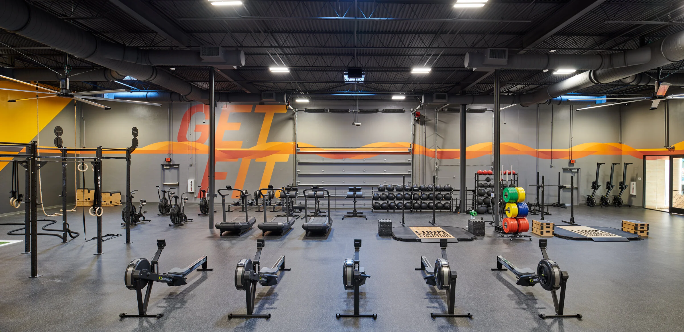
Before color corrections
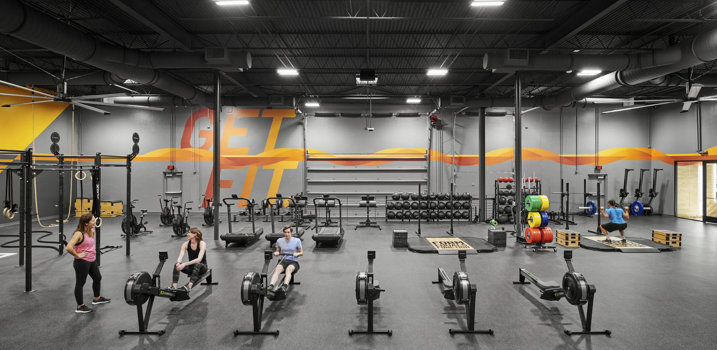
Final image after color corrections