architecture

How to Create Differing Views of a Multi-function Space as Efficiently as Possible

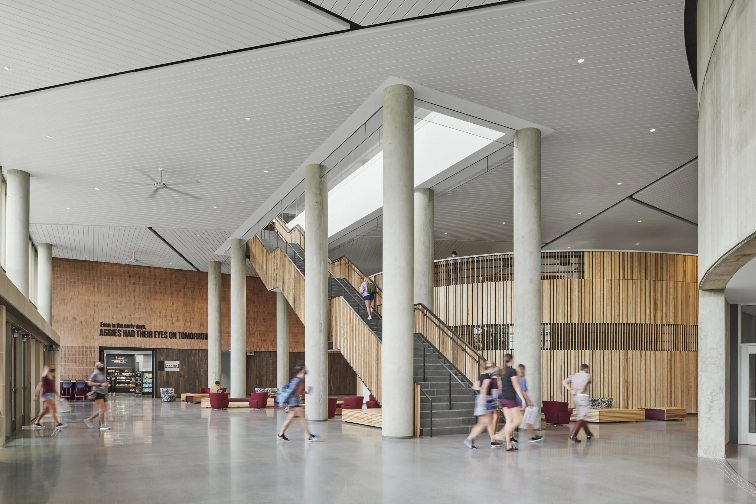
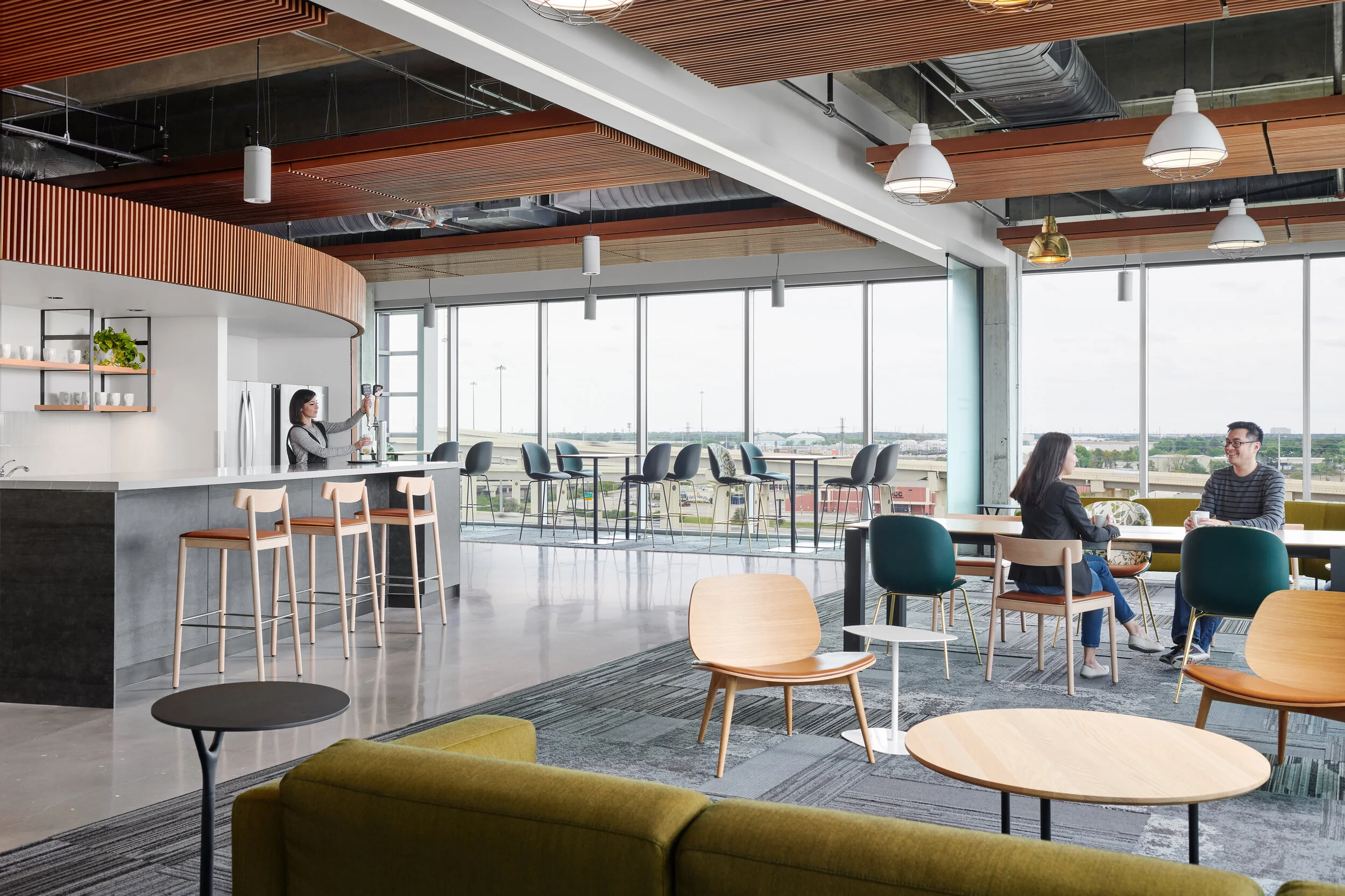
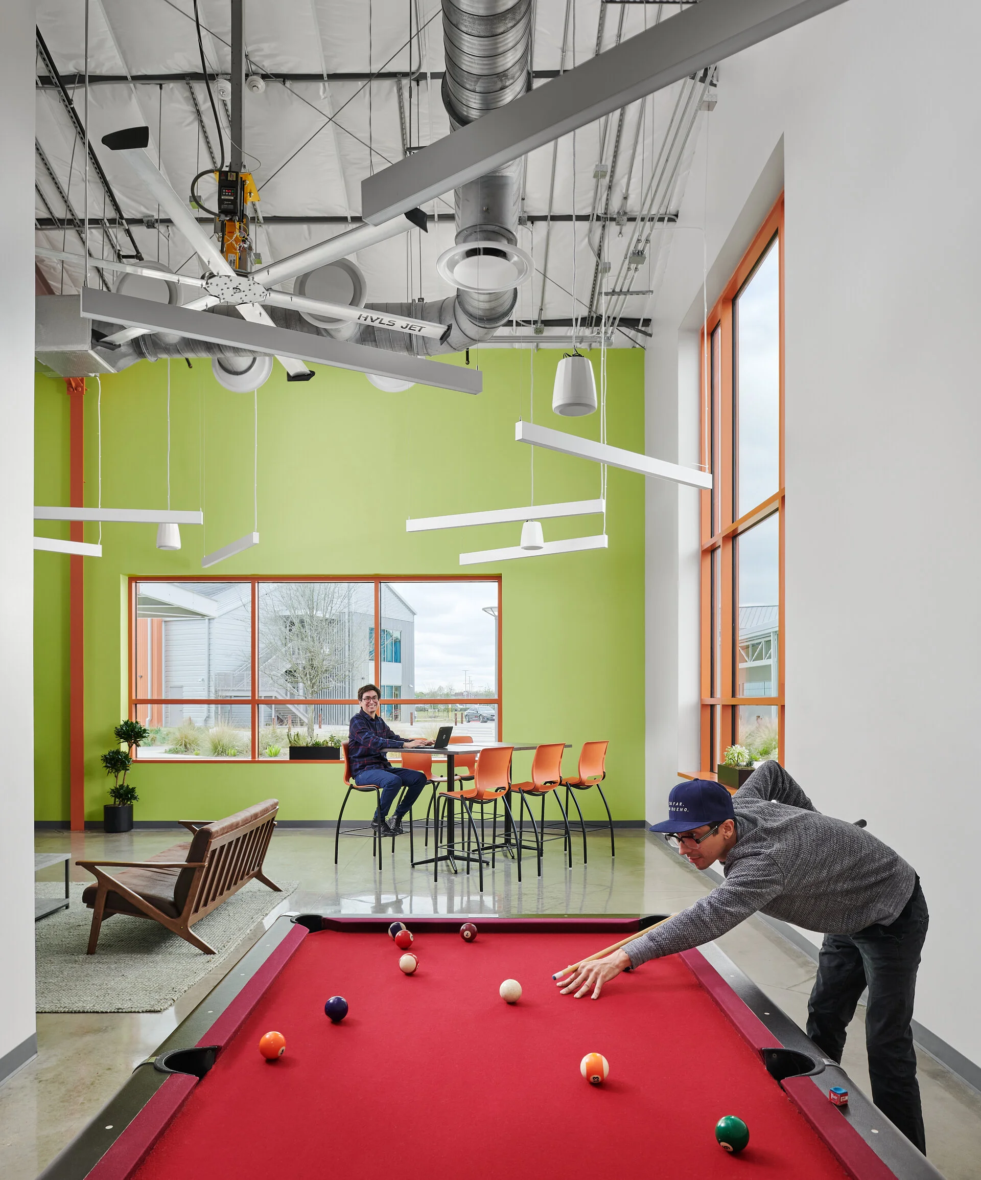
A common practice in architecture and interior design is for design teams to create spaces that can serve various functions depending on the occupants needs. As photographers of these spaces, we are often asked to show this flexibility images that illustrate multiple arrangements within. In years past, I would go about this by creating these images one after another from scratch, resulting in the capturing, lighting and assembling them each as singular images. With some practice I was able to develop a technique that allows the creation of these views as efficiently as possible by treating the first overall image as the base, and replacing only the altered portion of the scene as needed. Though this likely seems logical upon reading, I’ve found that it helps to hear someone talk through their thinking and process before it clicks in my head and changes the way that I organize myself during a shoot and in post-production to have as efficient a workflow as possible.

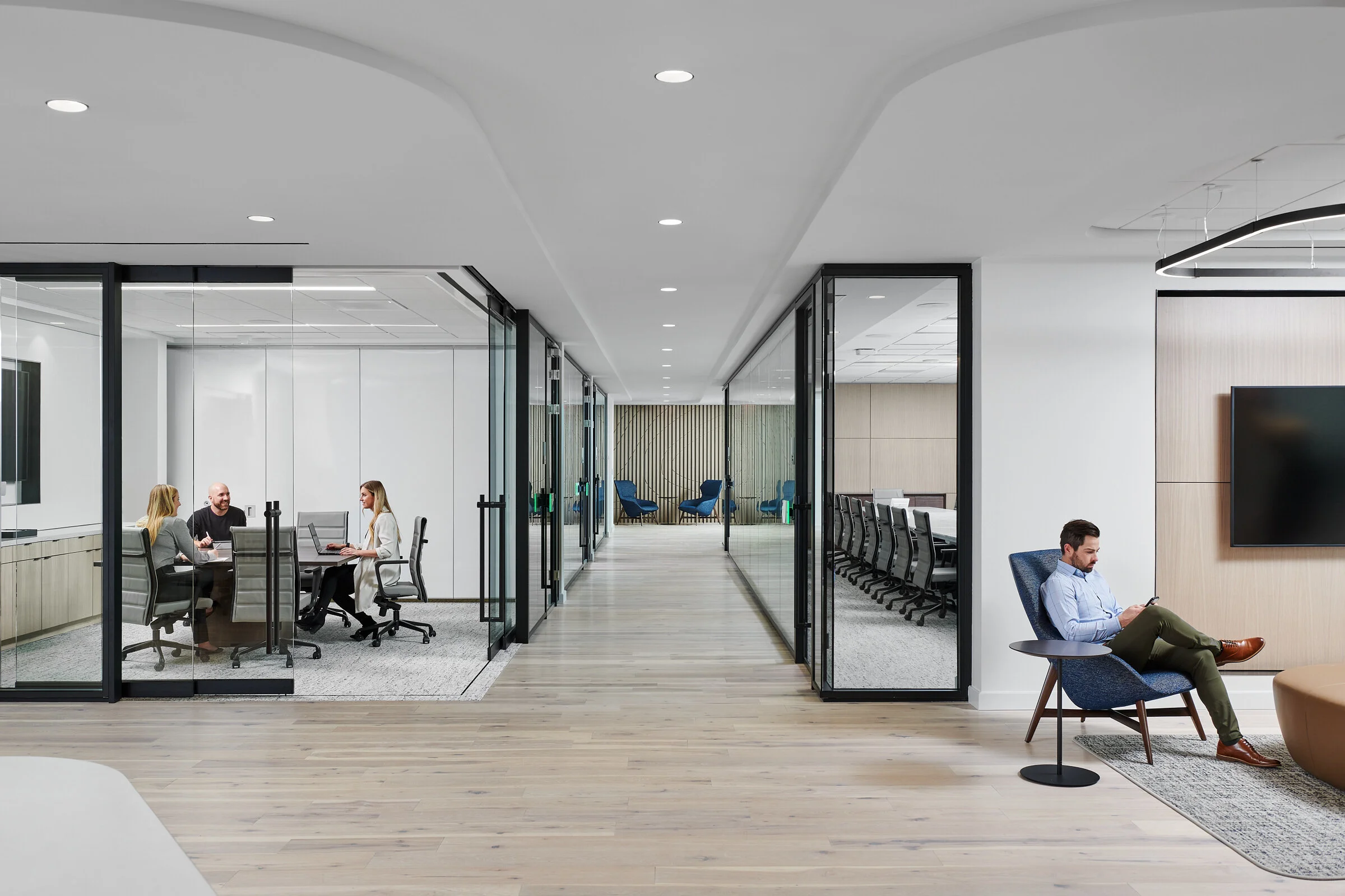
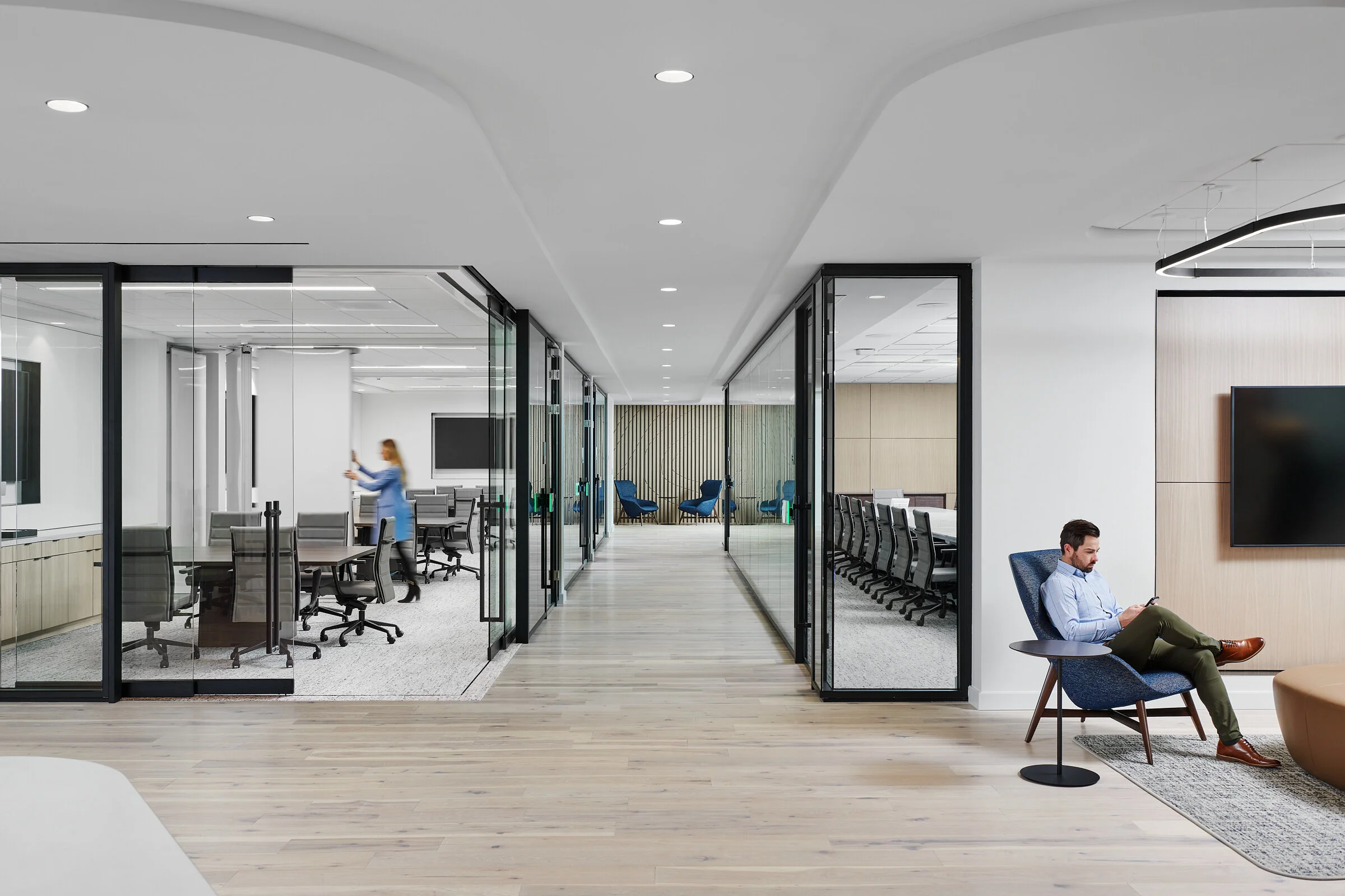
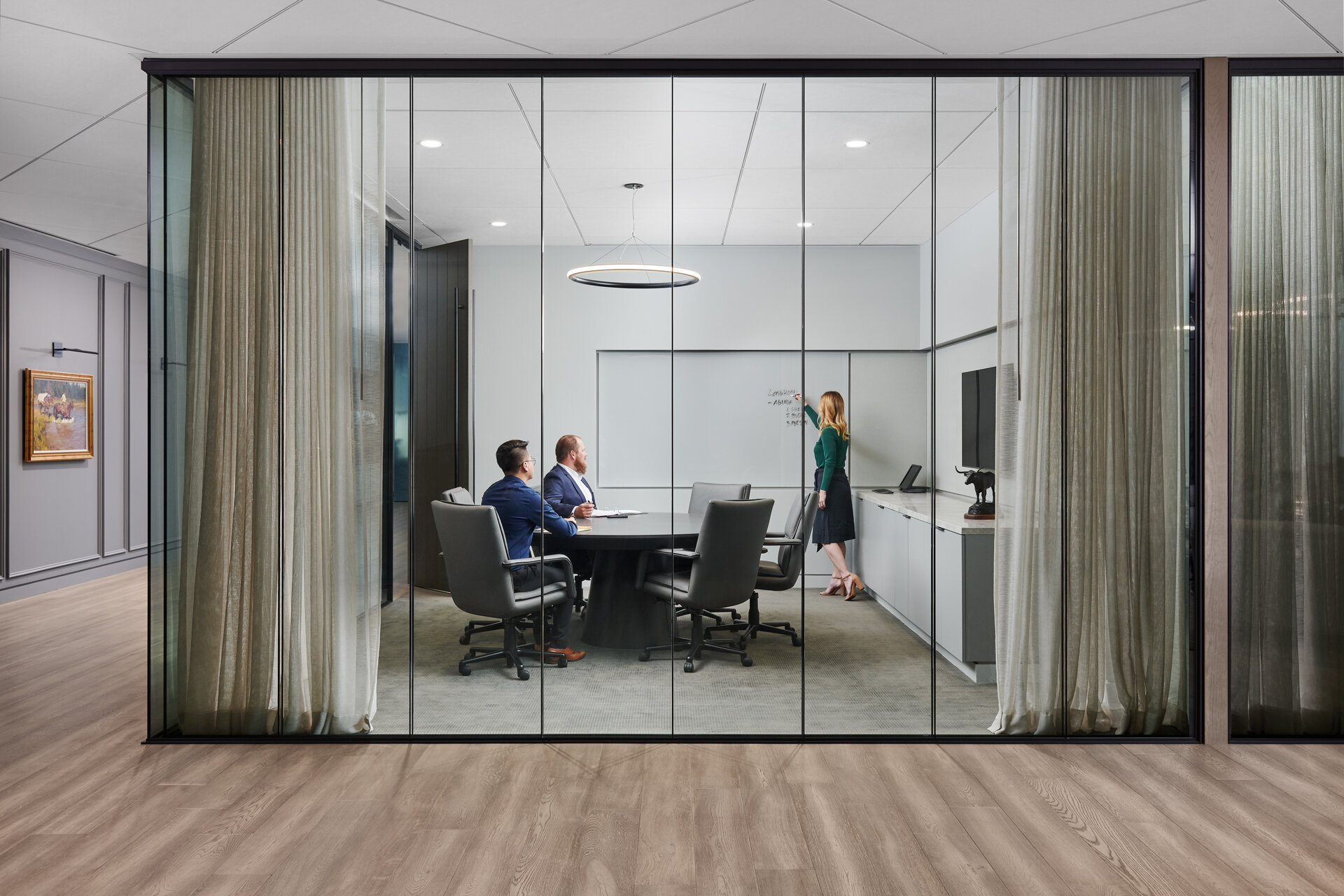
In the example shown, we are standing in the lobby of an Austin Law Office designed by Perkins + Will and are looking down a corridor separating a large board room on the right hand side and a series of meeting spaces on the left. These spaces on the left are designed with moveable partitions separating each of them to allow the occupants to expand or contract their capacity as needed. To begin, we kept the partitions closed and simulated a meeting in the visible meeting room, showing it as it would most often be used. Once we completed the photography of this overall scene, we then decided to show an alternate version with a person setting up the space to be a larger meeting area, while also showing them moving the partitions to illustrate the technology used in their design (this has an added benefit of not having to completely rearrange the space to accommodate a larger group). Once we established this alternate scenario, all we had to do was focus on that particular part of the image while shooting, knowing that we would be able to insert it quickly and efficiently in our post-production workflow. In this case, we chose to keep the model on the right as is for both images, with the thinking that the images won’t be shown side by side on a website or in print, but most likely just in presentations to clients to illustrate the moveable partitions creating a flexible space.

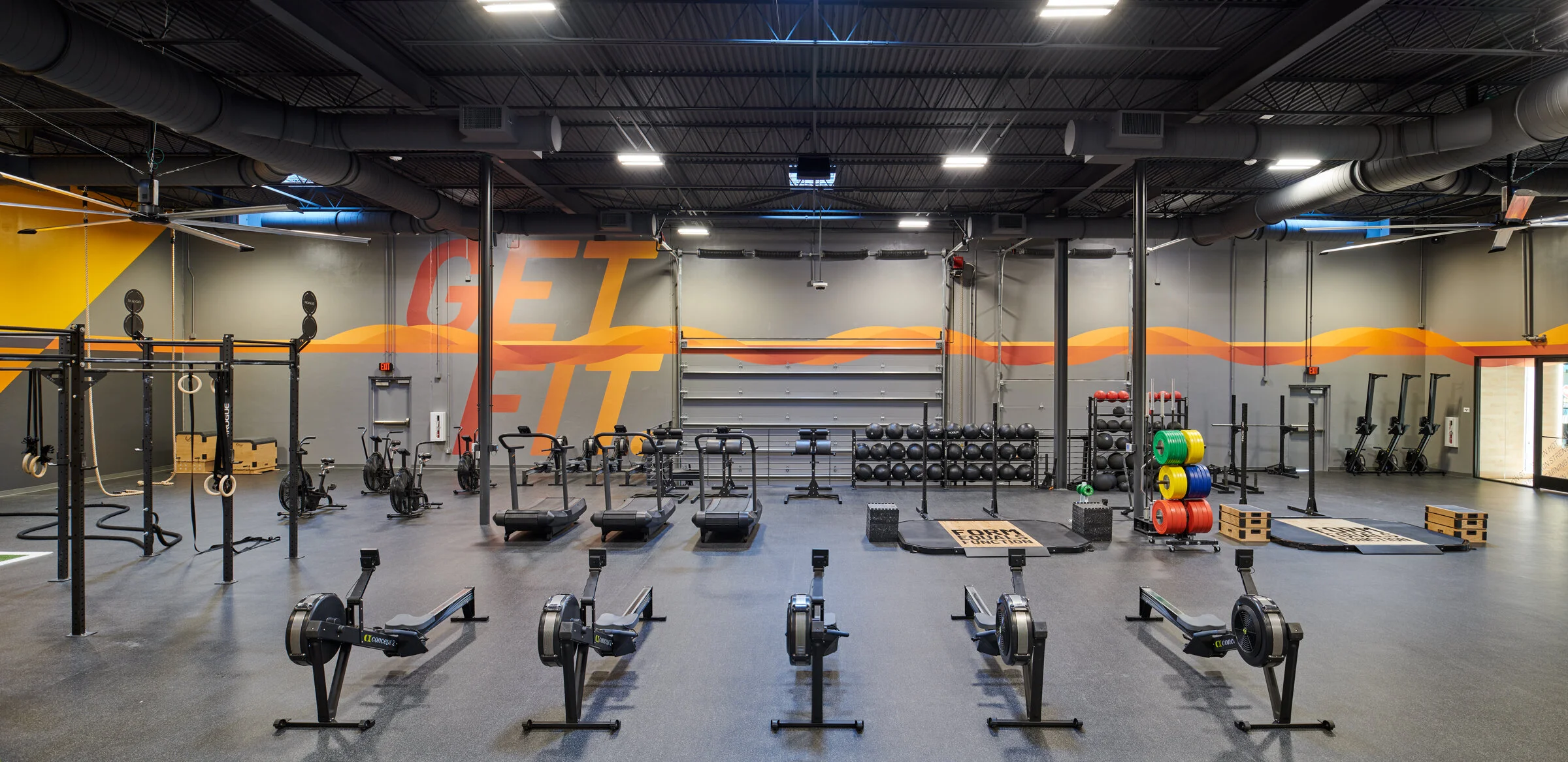
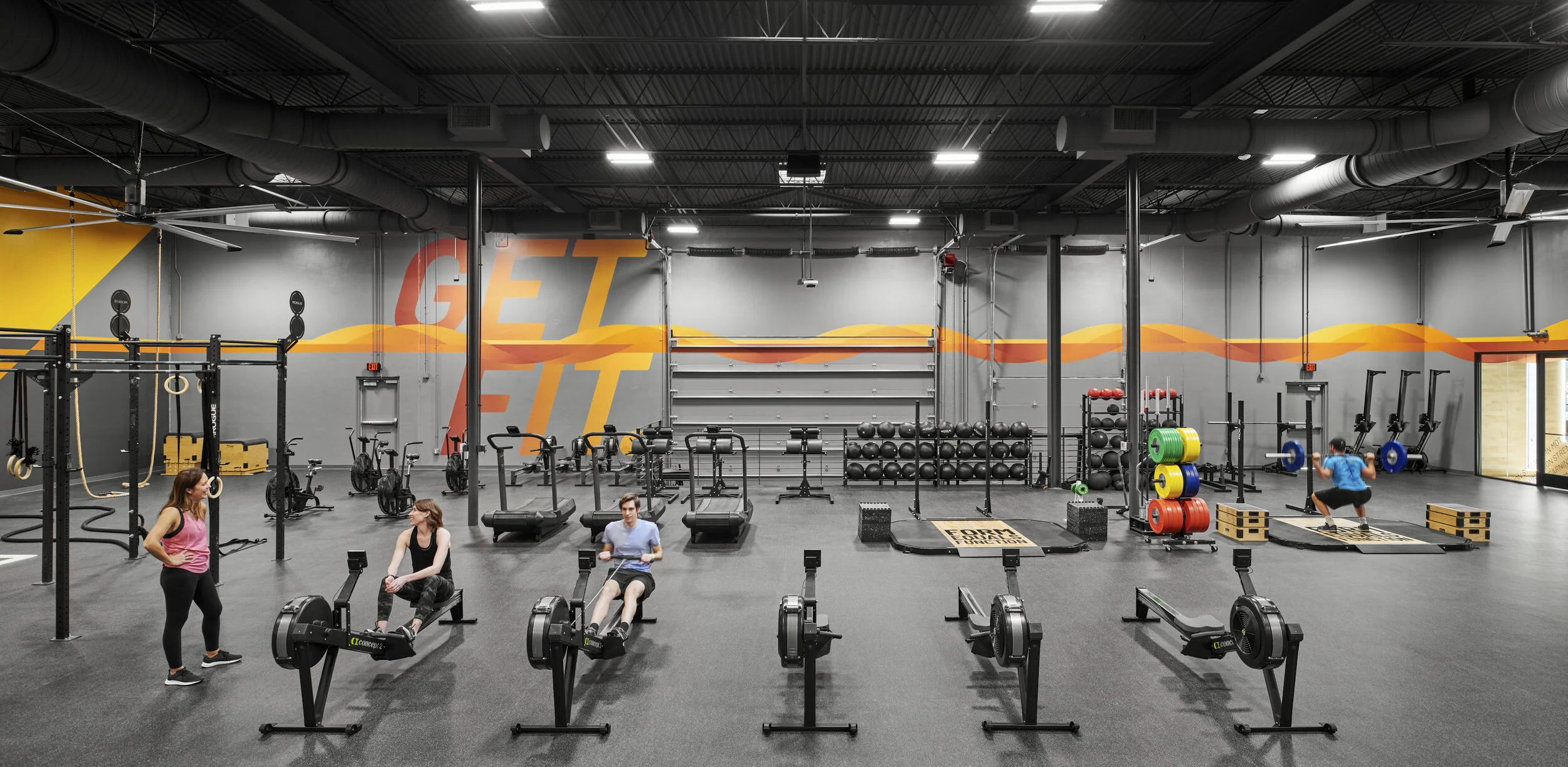
I have found this method useful in a variety of scenarios, including shooting a space with a closed and opened door giving a view into the function beyond, flexible furniture solutions (i.e. sit/stand desks), variations on people using a space, exterior views with moveable walls allowing for an indoor/outdoor connection, etc.

P+W_Shearman and Sterling_003_3.jpg
P+W_Shearman and Sterling_003_v4.jpg

Utilizing Capture One's Powerful Color Tools to Achieve Accurate Colors of a Space

To the casual reader of this blog (if that exists), you may question why color corrections take up so much of the information discussed when describing the process of creating an accurate and pleasing architectural image. For those of us in the industry, producing accurate colors to represent a space as honestly and straight forward as possible is one of the most challenging parts of the job. In many of my past posts discussing this process, I often employ a mixture of artificial lighting (flash) and saturation control in Photoshop. With larger spaces, we are often at the mercy of the lighting conditions of the spaces we are shooting and very frequently, the mixed lighting conditions in the built environment don’t initially translate well to digital images. The reason for this is that every light source has a varying temperature and when mixed, surfaces take on these temperatures often creating mixed results that are distracting and unpleasing to the eye. Generally this is not something that our eyes register when we are experiencing a place in person, but when capture in a still image, this can often make or break the feeling we get from them. In addition to these varying light sources, another major consideration of how light interacts within a space is the sorts of treatments of color within and how light may bounce off of that to affect the surrounding area.

All of these factors are at play in the example below, an image recently created with Perkins + Will in Dallas of their ParkerFit project at Parker University. ParkerFit is a large fitness facility in a revamped warehouse designed to have bold infographics wrapping around its perimeter to encourage movement and activate the space. On one wall, there is a floor to ceiling graphic with the facilities name embedded within, and on others, catch phrases and motivational texts stream across. Lighting wise, the space is lit both by an array of skylights, operable overhead doors and large, warm light fixtures to create a bright, comfortable environment to workout in. For a photographer, it is this combination of factors along with the dark interior finishes that create a particular challenge. From above and at points within the perimeter where the overhead doors exist, we have natural light that streams in with a blue light from the reflected sky. The lighting within is comprised of very warm practical lighting which produce a light several thousand kelvin off from the natural lighting. And to top everything off, the yellow and orange supergraphics are reflected on to all surfaces, creating a very challenging color palette with which to create a clean image that accurately describes the space and materials within.

To process this set of images in order to achieve the look I desired, I relied heavily on Capture One’s very powerful Color Editor tools while working through the RAW conversion before sending them into Photoshop for final retouching and color work. With the inclusion of adjustment layers several versions ago, Capture One opened up the opportunity to create very refined results within our RAW editing software that can be achieved very efficiently. In the video below, I share my process as I work through one of our overall hero shots of the space.

Before color corrections

Before color corrections

Final image after color corrections

Final image after color corrections

Refining an Architectural Image Using Subtle But Powerful Color Corrections in Capture One and Photoshop

Although composition may be king, a strong second in separating mediocre architectural and interior images from great ones is often reproducing the colors and tones of the materials and finishes within a space accurately and without contamination. In this latest video, I share my process for toning down competing color temperatures in a large, complex space consisting of large volumes clad in warm, natural materials and varying light sources.

One of the bigger challenges we face when photographing architectural and interior spaces is learning how to balance a variety of light sources with competing temperatures. In smaller spaces, we can often have full control of the light that we allow into our camera, whether by shaping the existing light sources using flags and diffusion, or by layering in our own lighting in order to represent a space as truly as possible. When we start getting into larger spaces, we are often left at the mercy of the existing lighting and can employ a few key techniques to balance out the mixture of lighting conditions. In this example, which is of a beautifully designed space at Texas A&M University designed in tandem by BORA and Perkins + Will. When you enter the building, you are greeted with a very large double height space consisting of large drum like volumes that contain large classrooms. These drums are clad in warm, natural material giving the space a particularly inviting presence that feels very connected to the lush campus the project sits on. Due to some of the level changes present in the space and the compression designed around some of the more intimate functions above and around these volumes, we began to encounter some issues with color casts in parts of the frame as we photographed it. Throughout the processing of this image in particular, I utilize a couple of techniques to balance the colors throughout all spaces to end up with an image that I think represents the feeling of being within the space. The main methods used here are controlling the neutral tones through a combination of saturation control and color layers, the latter of which helps to keep the natural tones of a material by overriding colors cast onto them from light sources such as daylight and incandescent fixtures.

TAMU Innovative Learning Building_014_v1.jpg

Using Patience and the Pen Tool to Create a Clean Interior Composite

For my latest video, I returned to an earlier screen recording (partly due to some more recent screen recordings being in the wrong format) of an image we created for IA Interior Architects in 2019. This particular example helps to illustrate how Photoshop’s Pen Tool can often be the best way to create a clean transition between the exterior and interior, particularly when it comes to a large workplace interiors with a darker interior core and perimeter of floor to ceiling windows.

Making selections in Photoshop can be an incredibly powerful mechanism for isolating specific areas, whether that be to assist with color corrections, blend exposures, or incorporate models and other portions of individual frames where the lighting might not allow for simply brushing in masks. Though I employ a large variety of methods when creating selections, the one that I’ve come to lean on the most over the past several years is the Pen Tool. The pen tool, though very tedious at first, can provide the most accuracy in a relatively short amount of time once using it is mastered and becomes second nature. One great resource for learning the ins and outs of the tool is a website called The Bézier Game, which walks you through using the pen tool to create increasingly complex shapes. After honing my skills at the tool, it’s now one of my most used and is often something I reach for when beginning to create a selection of any kind.

Anyone who photograph’s spaces, particularly commercial spaces, knows that there are certain ones with the potential for great imagery, but whose challenges jump out at you from the moment you encounter them. This image is a perfect example of that. Upon entering this space which serves as a break area for a workplace, it was immediately clear to me the potential that it had - warm would ceilings with great depth and texture, a variety of great furniture that are rich in color, unique lighting design and interesting geometry. Also very apparent the moment I entered was how each of these elements along with the wall of glazing that enclosed the space on two sides created a very challenging scenario for an image that shows the entirety of the space cleanly and with the lightness that you feel when you’re inside of it.

In order to tackle the variety of challenges within the space, we had to mentally break the space up into sections in order to cleanly light the furniture and finishes to best reduce color cast and reflections from the outer perimeter. A circular polarizer was also used to create ambient frames that cut down on that reflective glare as well, knowing that all of the above frames would be combined strategically in post-production in order to create the final result seen below.

IA_AWS-Houston_007_v2.jpg

Architectural Photography: Natural light vs. shooting with strobe

In architectural and interior photography, the debate between shooting using only available light versus supplementing the lighting with strobes has been around for a long time. In my latest video, I discuss the thinking behind choosing to use flash to help best define the interior of a space we recently shot. When relying solely on the existing lighting conditions within a space that has no natural lighting, we often are presented with the challenge of whether we show how the lighting design alone defines a space or if we are to supplement that light with our own in order to best show the materiality, tones and forms within a space. In this instance, I opted for the latter while softly blending in the existing lighting where it made the most sense. In my experience, I find that when we rely only on the lighting within a space, we are often presented with strong shadows and variations in color that while not present when experiencing the space in person, can create bold visual distractions when translating the space into a two dimensional image.

Photographing a space with strobe isn’t without its problems though and we are often left balancing the benefits with the compromises. For example, in the second shot shown in the video and displayed below, there is some very clever lighting design including a cove light above the vanity and a recessed light behind the floating mirrors within it. The challenge of combining both soft, pleasant lighting of the space and forms overall and showing these light features is that if we’re able to achieve them both, we begin to create a very flat image, void of any shadows or depth at all. As a result, we have to make the decision of what is the most significant aspect to illustrate for our purposes. If shooting this space for the lighting designers or a lighting manufacturer, there would be no question that we would lean these decisions towards the lighting in the space but when shooting for the designer, we have to think about all of the other aspects of the space that they were responsible for in choosing how to best showcase it. Custom casework, finishes, furniture and overall spacial layout are all important to illustrate within an image.

So what do you think? If you’re a designer, how would you most like the space be represented in an image? If you’re a photographer, what is your preferred direction?

Controlling Reflections in Glass

Ahh, reflections. On set, I will often joke that reflections are the architectural photographer’s arch nemesis. Specifically with commercial and workplace interiors, our objective is generally to show spaces and how they relate as clearly as possible in order to convey the design teams intent without unwanted distractions. One thing that makes this a challenge more than anything else is reflections in glass and other surfaces. Over the years, through a lot of on the job learning, skill sharing with others and trial and error, I have come up with a few techniques that I commonly will employ in order to remove unwanted reflections in order to best tell the story we are trying to convey through a particular image. These can be boiled down to essentially either controlling the offending ambient light on the camera side of the glass or overpowering it within the space that you are trying to show through it. Controlling the ambient light most often means some combination of lighting controls within the space (i.e. turning off all lights on the camera side of the glass that might reflect) or flagging it off using window shades, black fabric/plastic, and other methods. When these options aren’t enough, flash has proven to be an invaluable tool within the space we are trying to convey by overpowering any ambient light therefore removing what is being reflected in the glass from the camera side. Very often we are using several techniques for an individual shot in order to get the best results.

In the video below, I walk through four different scenarios where we were shooting single point perspectives through glazing systems that presented challenges with reflections that we had to troubleshoot in order to get the best shots possible. One thing that helped me greatly over the years is developing an understanding of how reflections work. In the study of photography, we are often taught about the angle of incidence, which is a way of describing how light sources and other objects will be reflected in a subject matter back into the camera. In the case of this topic, it is one of the things that helps me think of what is needed to control objects being reflected into a surface that we are trying to show as transparent. The diagrams below are my attempt at illustrating the angle of incidence when shooting similar shots to the examples below from my video. I have found that our instinct is often to think that all we need to do to control a reflection is build a flag the same size as the surface of the glass area, when really it is far larger. In my career, I’ve done a lot of work photographing for the art community and shooting framed work behind glass was one thing that really helped me get a grasp on this due to the more controllable scale of artwork versus that of architecture and interior spaces. The angle of incidence can be thought of as the reflected angle of that of the projected line from the point of the camera lens to the outer most portions of the reflective surface (glass). This is a complicated concept to describe in writing, so hopefully the diagrams will illustrate this clearly. The import part is to understand that not only are we having to consider what’s directly behind the area of the glass, but also above, below, left and right of that area relative to the camera position and angle. For example, the diagram below shows that the two lights nearest the wall will not be seen in the camera view, but the subsequent to will show up, as will a similar portion of the floor below.

Diagram of the angle of incidence when shooting a single point perspective of a wall with a window in it.

Diagram of the angle of incidence when shooting a single point perspective of a wall with a window in it.

A similar diagram, this time with a flag behind the camera.

A similar diagram, this time with a flag behind the camera.

Hopefully the above information and below video give some insights on how you can go about troubleshooting similar challenges in your own work and help result in cleaner images for yourself and your clients.

Behind the Scenes: Post-Production with Perkins+Will of their recently completed ShareNow office project in Austin

Austin has proven to be an ideal location for tech companies to office, whether it be as their main headquarters or as a regional location. As a result, there has been a drive to create fun and dynamic work spaces in the area that foster creativity, flexibility and fun for the companies employees and it has been a pleasure to be a part of showcasing many of them.

One of the last projects we shot in 2019 was this great space in East Austin designed by the local Perkins+Will office for their client, ShareNow. ShareNow (formerly Car2Go) has located their new offices right in the thick of East Austin, a thriving neighborhood that encompasses much of what Austin is all about just minutes away from Downtown. The office features a variety of dynamic spaces, but none more fun than this employee lounge, featuring some beautiful furnishings and a balcony overlooking East 6th Street.

When we arrived at the project, there was a beautiful mid-morning light streaming into the space, so we knew that we had to start with this shot first, leaving us to scramble a bit to fine tune the staging of all the furniture and related objects. In this case, because the office was still fairly new, this also sent several of the design team members scrambling throughout the space to collect a few additional objects from around the office in order to help populate the shelves in our view. While they focussed on those items, my assistant and I focussed on the big picture items such as the placement of furniture and rugs, and how everything related to one another. Lighting wise, we added some touches of lights to help shape the furniture and large light fixtures as well as clean up the color of the ceiling and other warm finishes. The end result shows a bright, inviting area for employees to have a break from their day, change work environments, have informal meetings and more.

Lastly, in this video I touch on what’s coming next on the YouTube channel, which will feature a behind the scenes look at the composition, staging, photography and post-processing of an interior vignette that I’ll be doing from my home during the stay-at-home orders put in place under the current circumstances.

Behind the Scenes: Post-Production with Page of their recently completed Baker Ripley East Aldine Campus Project

Page’s Houston office recently completed a very engaging campus project for Baker Ripley’s East Aldine location. The project includes many unique spaces intended to help the surrounding community with support facilities for projects and businesses that members may otherwise not have access to including a fab lab (think makers space), commercial kitchen and much more.

For the second video in my YouTube series, I thought I would share a technique that many architectural photographer’s employ, which is the stitch panoramic. A stitch pano is a way to create a larger viewing area than available from a particular focal length by combining different frames using the movements that are possible with either a technical camera or tilt-shift lenses on a DSLR. One challenging part of employing this technique that those of us who are using a DSLR with tilt-shift lenses experience is a slight misalignment of those frames due to parallax which results from the movements happening in the lens while the sensor remains in one place. With technical cameras you are able to shift the sensor around while the glass remains in the same place, allowing for much simpler aligning. I mention this because some people will likely notice this slight discrepancy in the video, which I later went back and corrected for the final image.

This image was created in order to show a community room and its relationship with a couple of the other buildings on the campus and the courtyard that separates them. The space had great, large windows that provided lovely natural light. We aimed to emphasize the natural light a bit with the use of strobes while also cleaning up some of the color cast. Adding a couple of models (which included one of the designer’s from Page and the expert billiards hand of my asssistant, Spencer Young) provides a sense of scale and more emphasis on the spaces functions. The room was a little cluttered from daily use when we arrived, so we spent a fair amount of time clearing some unwanted items out and getting things just how we wanted them for the image. Staging also meant getting the pool table just where we wanted it so it would anchor this one point perspective, creating some symmetry in an otherwise asymmetrical space.

Page_Baker Ripley_013_v1 1.jpg