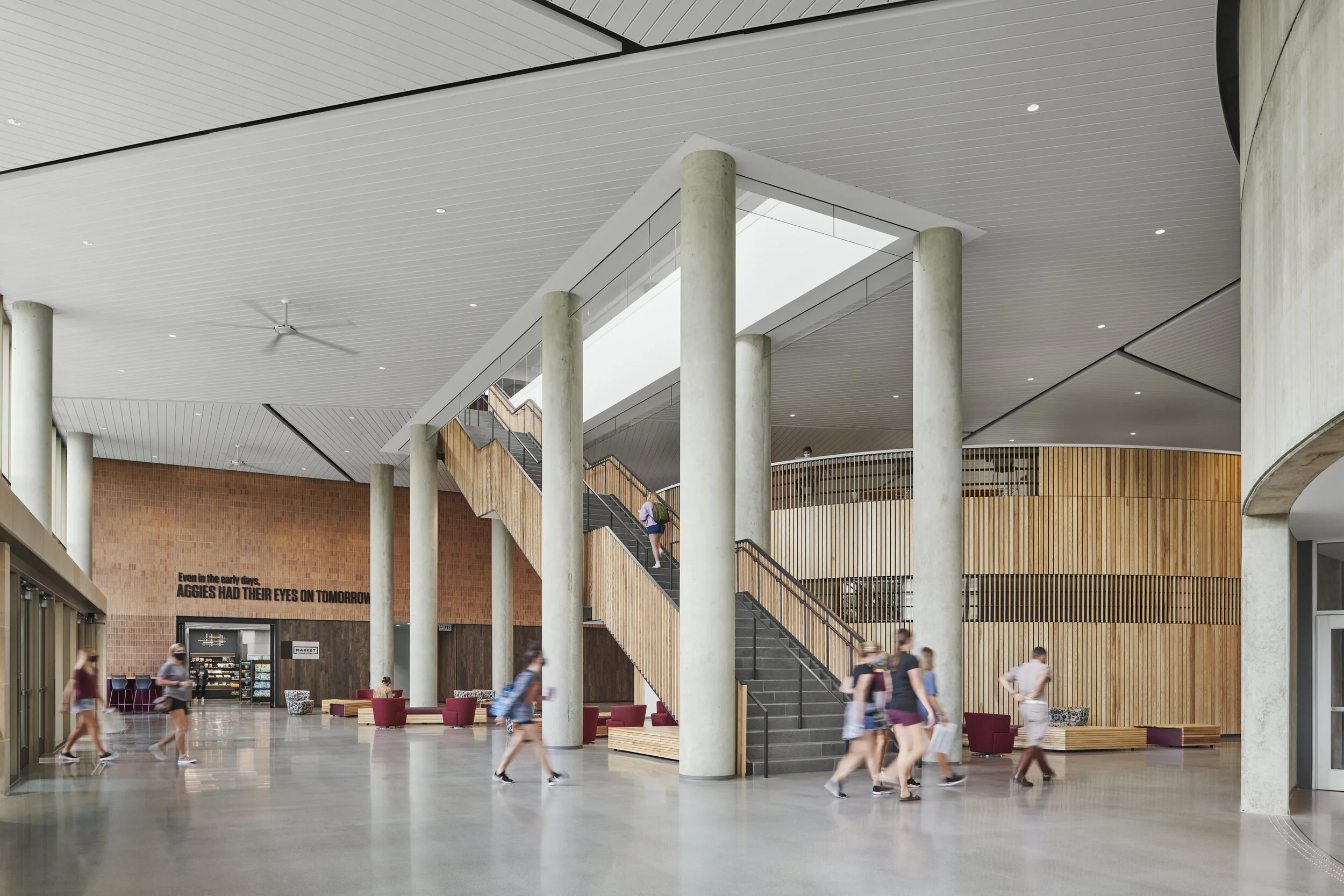
Although composition may be king, a strong second in separating mediocre architectural and interior images from great ones is often reproducing the colors and tones of the materials and finishes within a space accurately and without contamination. In this latest video, I share my process for toning down competing color temperatures in a large, complex space consisting of large volumes clad in warm, natural materials and varying light sources.
One of the bigger challenges we face when photographing architectural and interior spaces is learning how to balance a variety of light sources with competing temperatures. In smaller spaces, we can often have full control of the light that we allow into our camera, whether by shaping the existing light sources using flags and diffusion, or by layering in our own lighting in order to represent a space as truly as possible. When we start getting into larger spaces, we are often left at the mercy of the existing lighting and can employ a few key techniques to balance out the mixture of lighting conditions. In this example, which is of a beautifully designed space at Texas A&M University designed in tandem by BORA and Perkins + Will. When you enter the building, you are greeted with a very large double height space consisting of large drum like volumes that contain large classrooms. These drums are clad in warm, natural material giving the space a particularly inviting presence that feels very connected to the lush campus the project sits on. Due to some of the level changes present in the space and the compression designed around some of the more intimate functions above and around these volumes, we began to encounter some issues with color casts in parts of the frame as we photographed it. Throughout the processing of this image in particular, I utilize a couple of techniques to balance the colors throughout all spaces to end up with an image that I think represents the feeling of being within the space. The main methods used here are controlling the neutral tones through a combination of saturation control and color layers, the latter of which helps to keep the natural tones of a material by overriding colors cast onto them from light sources such as daylight and incandescent fixtures.

