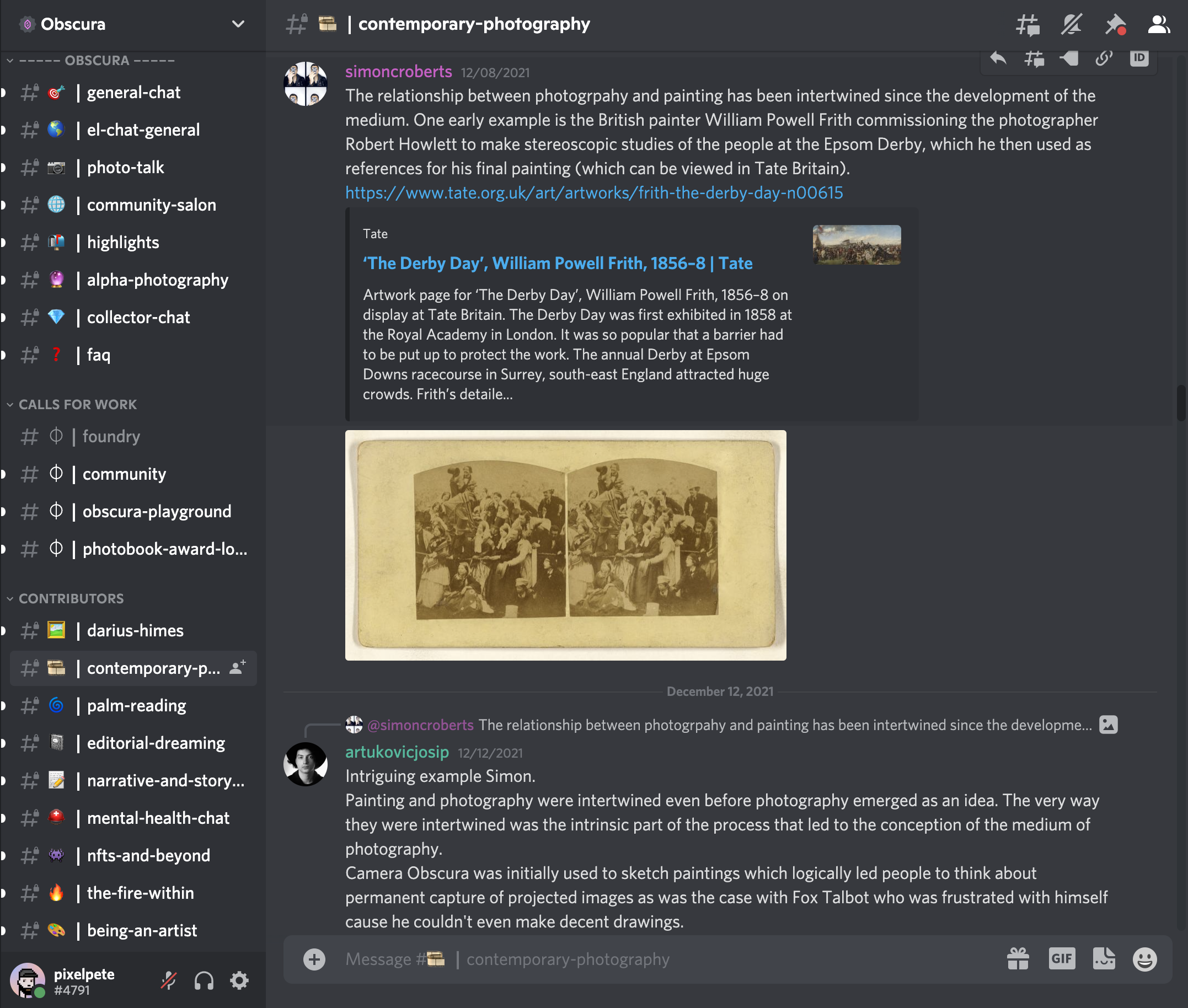
NFTs: An Introduction and Crash Course for Photographers

The Basics

Ahh, NFTs… where do we even begin? What on earth is an NFT and why does that guy at the coffee shop with an ape on his sweater keep smugly talking about them? Does photography, a medium that we traditionally have come to understand as largely physical, have a place in this new format? This post is an attempt to distill these and other questions down to a digestible resource for my fellow photographers and others who find themselves curious about a virtual path for the future of photography.

There’s no better place to start than the basics — so, what is an NFT? I will keep this relatively simple. NFTs (non-fungible tokens) are essentially a digital mechanism for the provable ownership of a digital asset. They do not represent a physical counterpart, but are instead a token that can cryptographically prove ownership (via the underlying technology of the blockchain) of what they represent. Some in the art world have come to think of this as a sort of Proof of Authenticity for digital goods. 

Okay, I have a vague idea of what an NFT is and represents, so what rights am I giving up by selling a work of my art as a digital token? This is understandably one of the first questions by people deciding whether or not making NFTs of their work is viable for them. In most cases, unless stated otherwise, creators of NFTs retain the copyright of the work, and collectors have the right to display (privately or publicly) it for non-commercial use and have the right to sell, trade or transfer the work. There have been some instances where creators sell their work specifically with a CC0 Creative Commons license, which relinquishes the rights to their work and allows collectors to use it publicly — but this has been very rare in the photography space to date.

Got it. So with all of that aside, I’ve heard that NFTs and crypto currencies are terrible for the environment so why should I consider taking part in that? This is a complex consideration that will ultimately depend on your own thoughts and research, but I will give my two cents and move on. Yes, the current conditions of Ethereum, which is the primary blockchain for most NFTs, are very resource intensive and take a toll on the environment in their current state. There is no denying this. The good news is that the team behind Ethereum is working to migrate to the next evolution of the protocol called ETH2.0, which will be entirely proof of stake and will no longer use mining for block validation. This will drastically reduce the energy consumption of the blockchain as a whole. Alongside this, many projects and protocols are releasing and operating “L2” solutions which are technologies that use proof of stake to process and store data on an isolated blockchain that interacts minimally with the main, more decentralized Ethereum blockchain. Technical aspects aside, this is an issue that is taken very seriously and there are many resources out there discussing it at length. There are also currently a number of NFT platforms already operating on Proof of Stake blockchains, but the largest market share is by far still on L1.


Photography and NFTs

Okay, phew! Now that we have some technical stuff out of the way, let’s move on to photography and its current state in the NFT universe. It is no secret that 2021 was a wild year for NFTs. Throughout all of the noise of PFP (profile picture) projects, meme-centric NFTs and social experiments, a few things have felt like they’ve stood out. These include generative/algorithmic art led by platforms such as Art Blocks and fxhash (RIP hic et nunc), AI/GAN (artificial intelligence) art, and most recently photography.


Why photography? Maybe it’s the inherent humanity represented in the medium or the recognition of value we already have assigned to it societally, but photographers have begun to really find their footing in this space and the collectors have responded with great enthusiasm.


Whether it be fine art, documentary or long-form projects, the response by collectors to quality, well-intentioned work has really taken hold, bringing photographers from all over the globe initial success in this new space.

Choosing a Platform and Reaching Collectors

The next question many have when deciding they're ready to make their work available as NFTs is what platform to do it on and how they might attract buyers once they have minted their work. As of the writing of this post, there are a few standouts in terms of platforms where photographers are finding success.

The first of these has to be Foundation (FND), which with their clean interface, decent discovery functionality and recent addition of collections has really jumped to the lead. With the implementation of collections, they made it possible for photographers to create their own smart contracts, which allows for great flexibility with controlling how the collection is shared on other marketplaces and how secondary royalties are established and collected. For example, a photographer with a collection on FND can customize the collection page for the work on a marketplace like OpenSea and set their secondary royalty percentage for sales that happen there, which is not possible when operating on other smart contracts outside of your control. Foundation also allows for the splitting of royalties if the work is a collaboration or a percentage is designated for charity. Currently, Foundation is available as invite-only with each new user getting three initial invites to disperse and then subsequent ones each time one of their invitees sells their first piece. The platform charges a 5% fee per transaction, recently reduced from 15%.

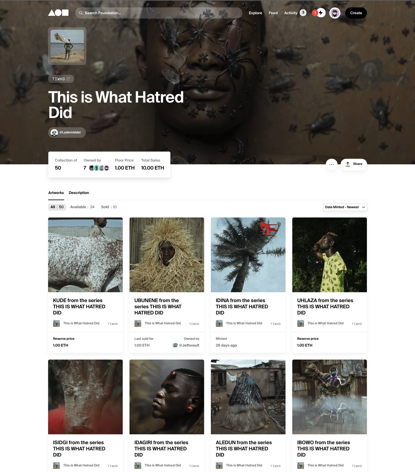
Cristina De Middel’s collection This is What Hatred Did on Foundation.

OpenSea (OS) is another simple option for minting your work. However, with limited search functions, no option for creating your own smart contracts and a less appealing layout, it hasn’t quite stood out like FND and others. One of the redeeming factors though is that the fee structure of OS transactions is quite low comparatively. OpenSea takes 2.5% of each transaction versus Foundation’s steep 15%. OpenSea is completely open for anyone to mint on.

Another option is Ephimera, which promised to be a platform for lens-based artists upon launching in 2020. Unfortunately, there has been little to no visible innovation to their interface over the past year resulting in a lack of popularity with collectors and making it a hard platform to recommend at the current time. Ephimera charges a fee of 10% per transaction and assigns a 10% royalty on the secondary market for sales done within the platform (secondary sales made on OS are a bit more complicated). Ephimera has an application process, which their website currently states is closed due to a large backlog. 


An arguably more elite platform is SuperRare (SR), which recently has made a push to include more photography as opposed to its initial focus in other mediums. SuperRare is known for having high-end work and, as a result, tends to feature artists on the upper end of the pricing spectrum. SuperRare charges a 15% fee for primary transactions and have a 10% royalty structure for secondary sales. To be featured as an artist on SR, you must submit an application that includes a one-minute submission video (though there have been recent cases where this is not necessary).

Beyond these dedicated platforms and marketplaces is the option to deploy your own smart contract and make the work available on your own website or elsewhere. This can be done using tools such as Manifold or via a partnership with a smart contract writer. This allows one to have complete control over the terms of the work and eliminates just about all transaction fees, but is also an added level of complexity and potential lack of exposure.

In terms of how to attract buyers, it is important to understand the social aspects of the current NFT space more broadly. One thing I’ve learned over the past year is how powerful and validating personal connection is not only to artists, but to collectors as well.

The NFT world is a largely social one that exists for the most part on Twitter and Discord. As someone who has spent most of their social media life in the Instagram ecosystem, I was slow to come around to Twitter, but have been really pleased with what I’ve found there once diving in. Now my feed is full of photography, positivity and sharing (and memes, of course), and is the first place I would encourage anyone entering the NFT space to start.

Screenshot from the Obscura discord.

For a deeper dive into the community aspect of things, Discord is the true ground zero. This can feel overwhelming to start, but there are a number of servers (linked below) that are specifically focused on photography and are full of incredible resources ready to engage. More than anything though, the best way to attract collectors of your work is to participate and engage with others within the community and to not be overly aggressive with selling.

Obscura - https://discord.gg/c65VMkfT

Assembly Art - https://discord.gg/JSjjERtr

Quantum Art - https://discord.gg/pEjrQXS7

Displaying Collections of Digital Art

Another mental hurdle some people have is thinking about how this digital work is meant to be displayed. Our default is to think in terms of the physical spaces we inhabit, but NFTs open up collecting in an entirely new way.

For one, we are not confined to collect only what we have the room to house. With NFTs, there has been an emergence in the variety of digital methods for displaying collected work. This can be in the form of virtual galleries that we can walk through in browser or using VR, scrollable galleries more akin to a traditional website, or a mixture of these and physical prints or books. One thing I’ve come to realize is that we are just in the beginning stages of how some of these emerging technologies will integrate with our current digital selves to create an entirely new and dynamic experience of sharing who we are and our artistic interests. Some examples of the ways users are expressing their collections are linked below.

A short walk thru of an OnCyber gallery.

https://gallery.so/0xrainbow/

https://gallery.so/jeff/

https://www.studio137.com/photography/

https://oncyber.io/freddie/

https://oncyber.io/chikaiphoto/

Collectors are learning an appreciation and skill for curation in new ways too. I have seen many creators and collectors express how gratifying this aspect of the space can be. In the past, even if you know who might be collecting your work, it’s rare to see whose company it keeps and in what context. This new ability and thinking of how to collect and display works often is creating an immediate dialog between the work of several artists, often strengthening personal relationships with those creators, their collectors and outside viewers.

Lessons Learned and Getting Started

Lastly, I wanted to say a few words about some lessons I’ve learned from my own experiences and things I’ve observed from others. 

For a long time, I wasn’t sure if or to what end photography fit into the greater NFT space. I began my journey through my involvement with generative art, which feels truly native to what NFTs offer and like a perfect fit. I was unsure whether photography would have the same validation in this purely digital space. It wasn’t until I was in a conversation in the Obsucra discord server when someone equated a RAW file as the digital equivalent to the film negative and how we can think of our processed digital images similar to a printed and processed negative, that I really began to see how these digital representations of our work could fit as part of the continued evolution of photography as a collectible medium. I am clearly not alone in this evolution in thinking, as is proven by the huge uprising in photographers and their collectors (old and new) coming into the space.

Upon entering the space, I initially felt that I had to change my work to make it more “digitally native” to be viable as an NFT. This resulted in first minting work that I had created years ago, mixing digital illustration with my imagery as well as some fun experiments in motion that in time I’m sure I will continue with. I’ve since learned that our still images hold just as much importance and relevance in this space as anything, and what’s important is strong work and storytelling. I’ve noticed this with several others who have struggled to find their initial footing, so I feel it is important to mention.

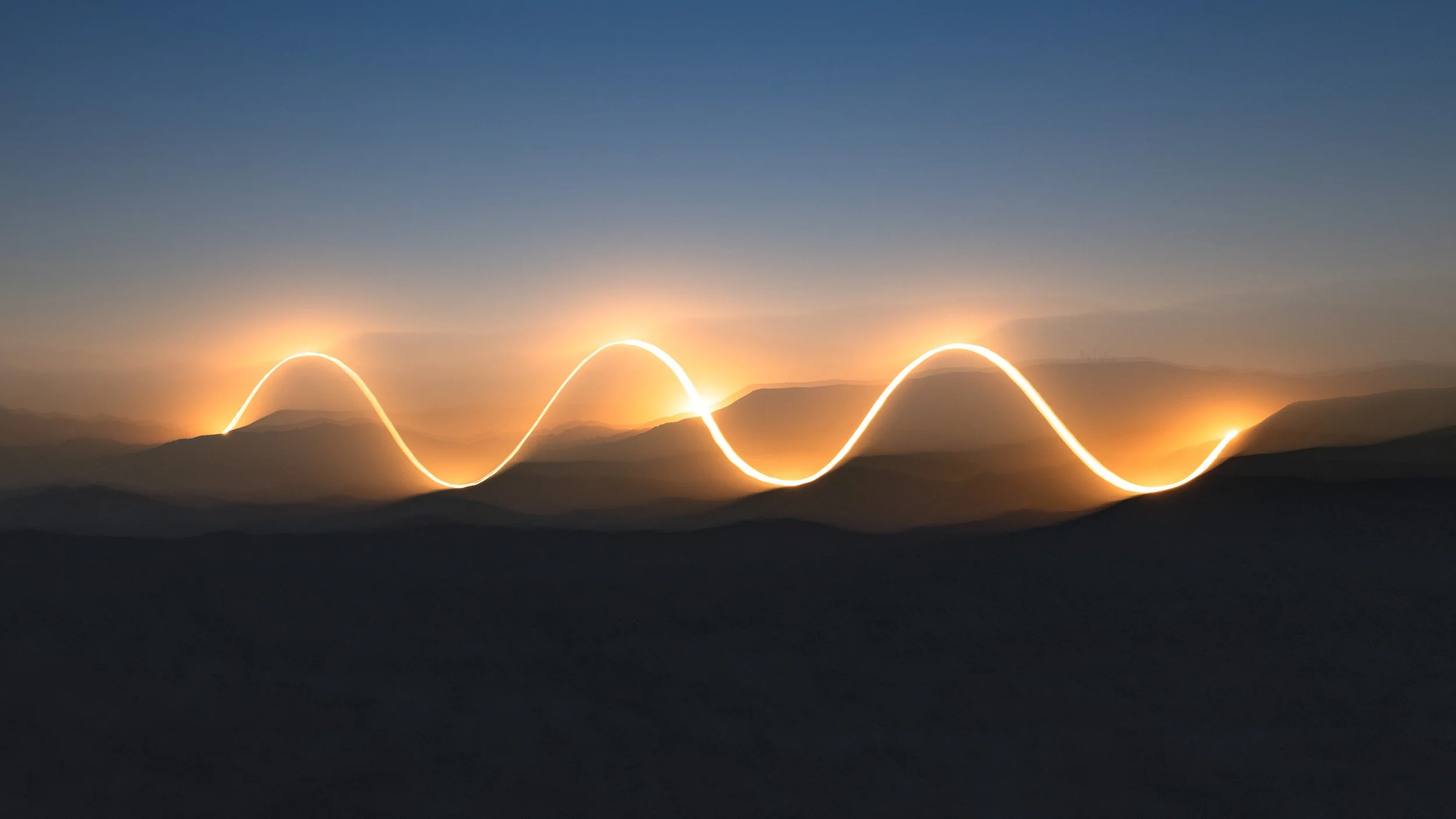
Still frame from Jeff Frost’s Sun Sine.

Finally, we can’t ignore the financial hurdles (and hopefully benefits) that are faced when first entering this unfamiliar space. As stated earlier, currently most NFTs are offered on the Ethereum network and alongside the rise of NFTs in 2020-21 came a rise in the price of crypto currencies, including Ethereum. To mint work onto a platform, you will have to pay gas in order to process the transaction and pay for the storage of the digital file your token represents. These costs can be substantial (think ~$75-150/high res image) and should be considered when thinking about how you price your work once it’s listed. A little research into gas fees and how to know when the best times to mint to avoid higher fees will go a long way. 


No one can say with certainty where NFTs will go from here, but what feels certain to me is that they are not going away and that they have provided an abundance of opportunity to those willing to explore the possibilities.

I hope this post helps shed some light and encourages others to dig a little beneath the surface to see if there’s a place for you and your art. I’ll be waiting, anxious to share and collect your work in my virtual world.


Peter Molick (pixelpete) is an architectural and fine art photographer based in Texas. He is also an advisor and curatorial board member to Art Blocks, a member of Untitled DAO, and has become an avid collector and proponent for NFTs.

How To Create a Clear and Descriptive Image of a Complex Interior Space

Showing the connection between adjacent spaces in a complex interior is often one of the more challenging aspects of shooting large commercial spaces that we face as photographers. In the video below, I use several techniques to clearly show how we created a dynamic shot from a glassed in meeting room that looks on to adjoining dining spaces, giving the viewer a clear overall sense of the connectivity created by the design team.

We had several hurdles to complete with as we approached this shot. To the rear of the camera we had floor to ceiling glass, which was letting bright daylight in to our rear creating unattractive light on our subject and very challenging reflections on the glass partition diving the meeting space with the dining. Through the use of the window shades and black cloth, we were able to control the majority of the reflectivity on the glass to the right of the frame, while largely controlling that to the left with a combination of flags and flash in the space beyond. When considering the lighting for the space, I divided it up into three spaces mentally as we prepared to shoot - the meeting room, the dining area to the right and the more intimate dining area with booths to the left. For the meeting room, a quick single flash was able to help define some of the forms and materials. There is a continuous length of windows to our immediate right which provided the majority of directional light for the dining space on that side, with a little help from some strobe to give things a little extra definition. And finally, a few flashes to fill in the darker and more complex space to the left.

Once the shots were complete, it was just a matter of merging these three areas as seamlessly as possible in a way that felt relatively natural and accomplished our goal of showing this dynamic space and how it is all connected. With the design team, we chose not to include any models as it was determined that the space was complex enough on its own and any added life would result in too much visual clutter.

Before

Before

After

After

Driving Home a Design Teams Vision via Dynamic Imagery of Connective Corridors

When photographing spaces for commercial clients, it’s often important for us to come up with a set of images that weaves the story of the design functions together in a way that is clear and concise. One way of doing this is to show how various spaces connect to one another to help give the viewer a better idea of how a project flows throughout. Design teams often utilize a number of strategies to engage project functions with its circulation spaces in order to create an environment that feels dynamic and open. For photographers, this can be a unique sort of challenge. Corridors with adjacent meeting rooms and/or offices often feature glass partitions that pose the ever present challenge of reflections and unwanted distractions, so we are tasked with how best to convey both this circulation core as well as those connected spaces.

In the examples below, we use a number of techniques to transform what might read as too busy of an image into ones that help to tell a rich story of the design teams visions. When on site, I am careful to think ahead at how I might assemble the final imagery, which allows me to work strategically and to focus on individual portions of the frame that will later easily be able to be put together. In both of these cases, I used a mixture of a base layer using the available light and frames taken using strobes and flagging to both control reflections and give the space within the glass walls some shape. As you can see from the before and after versions of both scenes, this allows a clear and concise depiction of how these spaces relate to one another.

Overcoming Challenges to Create a Clean, Descriptive Image of a Tight Space

Every composition when shooting workplace interiors comes with a unique set of challenges. Reflections, varying color levels and temperatures, malfunctioning building systems and more are often things we have to overcome in order to convey the overall design intent and vision. In the image below, we were tasked with showing a fairly complex space located at the end of an office space that contains a variety of spaces - two phone rooms, an open breakout space, work stations, offices and an adjacent conference room - WHEW. To make things even more tricky, lighting levels between the spaces were very inconsistent, particularly the central breakout space which was only lit with one large pendant, making it appear quite dark in an image with available light compared to the corridor and adjacent rooms. And on top of everything, I wanted to capture all of these spaces in one image in order to show their connectivity, so opted to do a vertical stitch using my 24mm tilt shift lens to help illustrate the open ceiling of the corridor.

When approaching a shot like this that joins multiple spaces which all could benefit from supplemental lighting, my instinct is generally to treat them individually, with an overall plan to combine them strategically in post. To begin with this strategy, I first run through a round over ambient frames in order to capture things as they are. From here we begin shooting each individual space with supplemental lighting at a fast enough shutter speed to regulate any ambient light that we could not control. Once this has all been captured, all that’s left to do is to jump into the computer to piece it all together, which is where the video below picks up.

As with most of my interiors shots created in this way, I first run through some quick RAW processing in Capture One to get each frame that will be used dialed in at the levels and white balance that I want including one frame specifically for the ceiling information which I spend a little more time on ensuring that the white ceiling doesn’t have any color contamination. From here I move into Photoshop, run a script I’ve got to auto merge and align the images, and can begin the exposure blending, color corrections and retouching. Since beginning to share these processing videos, I am frequently asked about the time it takes to do this work in post and the value of it. This image took 50 minutes from start to finish in the computer. As for the value, all I can say is that with time, I feel that I have become very efficient in the way I go about both my post-processing and shooting on site and think that with some practice, these things can take far less time than they may first appear. Workplace interiors and similar spaces are inherently challenging ones to photograph, but the reward of providing clients with images that convey their designs as cleanly and straight forward as possible is invaluable.

How to Create Differing Views of a Multi-function Space as Efficiently as Possible

A common practice in architecture and interior design is for design teams to create spaces that can serve various functions depending on the occupants needs. As photographers of these spaces, we are often asked to show this flexibility images that illustrate multiple arrangements within. In years past, I would go about this by creating these images one after another from scratch, resulting in the capturing, lighting and assembling them each as singular images. With some practice I was able to develop a technique that allows the creation of these views as efficiently as possible by treating the first overall image as the base, and replacing only the altered portion of the scene as needed. Though this likely seems logical upon reading, I’ve found that it helps to hear someone talk through their thinking and process before it clicks in my head and changes the way that I organize myself during a shoot and in post-production to have as efficient a workflow as possible.

In the example shown, we are standing in the lobby of an Austin Law Office designed by Perkins + Will and are looking down a corridor separating a large board room on the right hand side and a series of meeting spaces on the left. These spaces on the left are designed with moveable partitions separating each of them to allow the occupants to expand or contract their capacity as needed. To begin, we kept the partitions closed and simulated a meeting in the visible meeting room, showing it as it would most often be used. Once we completed the photography of this overall scene, we then decided to show an alternate version with a person setting up the space to be a larger meeting area, while also showing them moving the partitions to illustrate the technology used in their design (this has an added benefit of not having to completely rearrange the space to accommodate a larger group). Once we established this alternate scenario, all we had to do was focus on that particular part of the image while shooting, knowing that we would be able to insert it quickly and efficiently in our post-production workflow. In this case, we chose to keep the model on the right as is for both images, with the thinking that the images won’t be shown side by side on a website or in print, but most likely just in presentations to clients to illustrate the moveable partitions creating a flexible space.

I have found this method useful in a variety of scenarios, including shooting a space with a closed and opened door giving a view into the function beyond, flexible furniture solutions (i.e. sit/stand desks), variations on people using a space, exterior views with moveable walls allowing for an indoor/outdoor connection, etc.

P+W_Shearman and Sterling_003_3.jpg
P+W_Shearman and Sterling_003_v4.jpg

Utilizing Capture One's Powerful Color Tools to Achieve Accurate Colors of a Space

To the casual reader of this blog (if that exists), you may question why color corrections take up so much of the information discussed when describing the process of creating an accurate and pleasing architectural image. For those of us in the industry, producing accurate colors to represent a space as honestly and straight forward as possible is one of the most challenging parts of the job. In many of my past posts discussing this process, I often employ a mixture of artificial lighting (flash) and saturation control in Photoshop. With larger spaces, we are often at the mercy of the lighting conditions of the spaces we are shooting and very frequently, the mixed lighting conditions in the built environment don’t initially translate well to digital images. The reason for this is that every light source has a varying temperature and when mixed, surfaces take on these temperatures often creating mixed results that are distracting and unpleasing to the eye. Generally this is not something that our eyes register when we are experiencing a place in person, but when capture in a still image, this can often make or break the feeling we get from them. In addition to these varying light sources, another major consideration of how light interacts within a space is the sorts of treatments of color within and how light may bounce off of that to affect the surrounding area.

All of these factors are at play in the example below, an image recently created with Perkins + Will in Dallas of their ParkerFit project at Parker University. ParkerFit is a large fitness facility in a revamped warehouse designed to have bold infographics wrapping around its perimeter to encourage movement and activate the space. On one wall, there is a floor to ceiling graphic with the facilities name embedded within, and on others, catch phrases and motivational texts stream across. Lighting wise, the space is lit both by an array of skylights, operable overhead doors and large, warm light fixtures to create a bright, comfortable environment to workout in. For a photographer, it is this combination of factors along with the dark interior finishes that create a particular challenge. From above and at points within the perimeter where the overhead doors exist, we have natural light that streams in with a blue light from the reflected sky. The lighting within is comprised of very warm practical lighting which produce a light several thousand kelvin off from the natural lighting. And to top everything off, the yellow and orange supergraphics are reflected on to all surfaces, creating a very challenging color palette with which to create a clean image that accurately describes the space and materials within.

To process this set of images in order to achieve the look I desired, I relied heavily on Capture One’s very powerful Color Editor tools while working through the RAW conversion before sending them into Photoshop for final retouching and color work. With the inclusion of adjustment layers several versions ago, Capture One opened up the opportunity to create very refined results within our RAW editing software that can be achieved very efficiently. In the video below, I share my process as I work through one of our overall hero shots of the space.

Before color corrections

Before color corrections

Final image after color corrections

Final image after color corrections

Refining an Architectural Image Using Subtle But Powerful Color Corrections in Capture One and Photoshop

Although composition may be king, a strong second in separating mediocre architectural and interior images from great ones is often reproducing the colors and tones of the materials and finishes within a space accurately and without contamination. In this latest video, I share my process for toning down competing color temperatures in a large, complex space consisting of large volumes clad in warm, natural materials and varying light sources.

One of the bigger challenges we face when photographing architectural and interior spaces is learning how to balance a variety of light sources with competing temperatures. In smaller spaces, we can often have full control of the light that we allow into our camera, whether by shaping the existing light sources using flags and diffusion, or by layering in our own lighting in order to represent a space as truly as possible. When we start getting into larger spaces, we are often left at the mercy of the existing lighting and can employ a few key techniques to balance out the mixture of lighting conditions. In this example, which is of a beautifully designed space at Texas A&M University designed in tandem by BORA and Perkins + Will. When you enter the building, you are greeted with a very large double height space consisting of large drum like volumes that contain large classrooms. These drums are clad in warm, natural material giving the space a particularly inviting presence that feels very connected to the lush campus the project sits on. Due to some of the level changes present in the space and the compression designed around some of the more intimate functions above and around these volumes, we began to encounter some issues with color casts in parts of the frame as we photographed it. Throughout the processing of this image in particular, I utilize a couple of techniques to balance the colors throughout all spaces to end up with an image that I think represents the feeling of being within the space. The main methods used here are controlling the neutral tones through a combination of saturation control and color layers, the latter of which helps to keep the natural tones of a material by overriding colors cast onto them from light sources such as daylight and incandescent fixtures.

TAMU Innovative Learning Building_014_v1.jpg

Using Flash to Control Reflections When Shooting Through Glass

A few months back, I posted a video and write up describing a handful of techniques that I employ in order to effectively shoot a space that is behind glass without distracting reflections that distract from the design beyond. This video shows a recent example of one of these images from a project we shot with Perkins + Will of an office space in Dallas. This particular space featured a soft seating area in front of a large graphic wall. To add to the difficulty of capturing the space and how it sits within the larger context, the enclosing glazing features a film with a grid pattern which proved challenging when attempting to figure out how best to show the detail of the it, the wall graphic and some models using the room.

By dividing the room into two halves when determining how to light it, we are able to recreate the practical lighting that exists within it, giving a pleasing and natural quality of light. This lighting technique in conjunction with fast shutter speeds allows us to remove the majority of reflections from the camera side of the glass, however we did encounter some harsh reflections in the left hand chair from our strobes bouncing off of the white frames in the left of the frame, leading us to have to flag off those frames using black cloth.

Once lighting was complete, all that was left to do in post was to composite the information together and do some color corrections to end up with the below result.

P+W_Tenet Health_015_v1.jpg

Using Patience and the Pen Tool to Create a Clean Interior Composite

For my latest video, I returned to an earlier screen recording (partly due to some more recent screen recordings being in the wrong format) of an image we created for IA Interior Architects in 2019. This particular example helps to illustrate how Photoshop’s Pen Tool can often be the best way to create a clean transition between the exterior and interior, particularly when it comes to a large workplace interiors with a darker interior core and perimeter of floor to ceiling windows.

Making selections in Photoshop can be an incredibly powerful mechanism for isolating specific areas, whether that be to assist with color corrections, blend exposures, or incorporate models and other portions of individual frames where the lighting might not allow for simply brushing in masks. Though I employ a large variety of methods when creating selections, the one that I’ve come to lean on the most over the past several years is the Pen Tool. The pen tool, though very tedious at first, can provide the most accuracy in a relatively short amount of time once using it is mastered and becomes second nature. One great resource for learning the ins and outs of the tool is a website called The Bézier Game, which walks you through using the pen tool to create increasingly complex shapes. After honing my skills at the tool, it’s now one of my most used and is often something I reach for when beginning to create a selection of any kind.

Anyone who photograph’s spaces, particularly commercial spaces, knows that there are certain ones with the potential for great imagery, but whose challenges jump out at you from the moment you encounter them. This image is a perfect example of that. Upon entering this space which serves as a break area for a workplace, it was immediately clear to me the potential that it had - warm would ceilings with great depth and texture, a variety of great furniture that are rich in color, unique lighting design and interesting geometry. Also very apparent the moment I entered was how each of these elements along with the wall of glazing that enclosed the space on two sides created a very challenging scenario for an image that shows the entirety of the space cleanly and with the lightness that you feel when you’re inside of it.

In order to tackle the variety of challenges within the space, we had to mentally break the space up into sections in order to cleanly light the furniture and finishes to best reduce color cast and reflections from the outer perimeter. A circular polarizer was also used to create ambient frames that cut down on that reflective glare as well, knowing that all of the above frames would be combined strategically in post-production in order to create the final result seen below.

IA_AWS-Houston_007_v2.jpg

Piecing Together a Complex Multi-Layered Interior Space

In workplace design, there are some spaces that are just inherently difficult to capture cleanly no matter how you approach them. That was the case with this space at the Khoros office designed by Austin’s Urban Foundry Architecture, where they created a dynamic work environment with multiple breakout and collaboration spaces mixed in with the workstations themselves. These spaces were given separation through the implementation of screen walls which help visibly and physically divide the functions, but while doing so, make a particular challenge for us photographers. To add to the challenge, this shot in particular was created towards the end of a very full day of interiors, which led to our pushing through the photography as quickly and efficiently as possible. After coming up with a comfortable way of arranging the existing furnishings to our selected composition, we proceeded to capture a variety of flash frames attempting to isolate varying sections of the space in a way that made sense to me when thinking down the line of how I would approach the compositing in post-production. This led to thinking of the space as a foreground, divided into two - left and right, a middle ground, and the remaining background information. The lighting within the space was very challenging, so choosing to light the majority of the two nearer spaces with supplemental lighting was a no brainer, but the nature of the screen walls meant that this would be quite the challenge once back to the computer.

In this video, you will see as I struggle through piecing all of these sections together to create a clear image that describes the spaces and their connections well.

UFARC_Khoros_011_v1.jpg

Balancing the Lighting Behind a Translucent Wall Installation in Post-Production

Some of the spaces that we are tasked with showcasing as architectural photographers are inherently trickier than others. During a recent shoot of a very thoughtfully designed children’s museum in Corpus Christi by Page, one of these spaces was a waiting area outside of the hospitals PICU. The waiting area features a translucent wall with an installation on it which separates the area from an adjoining corridor to allow for some privacy. Walls like this make a major impact on a space, but can be particularly challenging to photograph accurately for a variety of reasons, so we had our work cut out for us. Opposite the corridor from this glass wall is another large window that looks down on a lightwell/atrium connected to the hospital’s main concourse which further complicated any attempt at getting a clean backlit shot of the entire wall in one image. As a result, we wound up taking a series of shots where we backlit the wall in sections in order to clearly see the wall itself free from reflections and color contamination from within the space that we were shooting.

This video shows the entire post-production in Photoshop as I assembled several frames to end up with the final result - a clean, straight forward image of this colorful yet calming space. Throughout the first half of the video, you’ll see as I concentrate on this installation feature specifically, piecing together a final result that shows it evenly lit and without distraction. This was achieved by using a number of techniques from compiling those backlit flash frames mentioned above as well as creating adjustment layers to make local adjustments in areas where there was inconsistent lighting due to the constraints we were dealing with on the opposite side of the glass.

Finally, the image really comes together when we finish it off by incorporating life into the scene using a family seated in the waiting area in the foreground and a doctor at the elevator bank - all of which couldn’t have happened without the thoughtful planning and participation from the design team and end users!

Page_Driscoll Childrens Hospital_014_v1.jpg

Architectural Photography in 2020: Face Masks or No Face Masks?

As many of us find ourselves returning to photographing projects after several months of limited work, the most common consideration of the times when working out the logistics of shooting spaces in these unprecedented times is whether to depict models/people within the spaces wearing masks or not. Even well before we returned to shooting, I was having conversations with several clients discussing what photography would look like when we were able to safely return to it and most specifically, how do we think about the treatment of our new normal of wearing face masks in shared spaces. Early on, many of us felt that it would likely feel reactionary to photograph people wearing masks when creating imagery for a project that will be used long after the pandemic is over. As things have evolved and we continue to see rising numbers and no end in sight for the near future, I have experienced a variety of viewpoints on the subject as we all work through how to best depict projects in the current times.

The answer to this question may be largely dependent on project type. For civic, cultural, education and public spaces, I think that it can make sense to show people as they are (or would be, if spaces are not opened) in the moment, giving the images and honest, journalistic quality. I have heard from designers of these types of projects and their PR teams, that it may be particularly desirable if there are plans for the work to be published in the near term. Workplaces, retail, restaurants and hotels on the other hand may not have an immediate benefit or obvious use for showing people masks and images of those spaces with masked subjects may lose their usefulness over time as we move past the current situation. Many design teams recently have been opting to have us capture a few images in the set featuring people both wearing and not wearing face masks in order to have the option for the immediate use, but also having the ability to use the unmasked photos with more flexibility down the line. This is the case with the image shown in this video that was created recently in collaboration with the design team at Perkins + Will Dallas of an office for a health care company.

This question is just one of several floating around our industry these days as we all adapt to the current situation and return (at varying frequency), to work. Others include what project types are appropriate to photograph. Education projects have been pushed back because as campuses are empty, how do we consider documenting the spaces in an era of architectural photography where it’s common and desirable to show people using a space. Workplaces, office buildings, and other commercial spaces have incorporated significant efforts in signage and restrictions on usable spaces, requiring us to often have to adapt on the fly as we enter a space that may not be quite as expected or that poses significant challenges when trying to photograph them free of clutter that take away from the original design intent. Many firms are reprioritizing their strategies for photography to fit with what makes the most sense to photograph in a time of limited occupancy and sensitivity to the unknown future of certain project types.

What are you experiencing in the sectors that you work in? How do you feel we should be portraying these spaces and the people within?

P+W_Signify Health_003_v1.jpg

Post-processing of a Commercial Lobby Space in Photoshop

With any workplace interior project these days, a key establishing shot in a set of images is one of the lobby/reception area, a space that often sets the tone for the entire project design. In these shots, it’s important to give a sense of what it feels like to enter a space and the relationship it has with the connecting workplace areas beyond. The video below shows a walkthrough of the post-production for this establishing shot of The Zebra offices in East Austin designed by IA Interior Architects. The Zebra is an insurance comparison service, whose mission “Insurance in Black and White” can be seen clearly throughout the projects design and within this entry area. To see how this design language continues into further spaces, check out our previous video on controlling reflections in glass (some techniques which are also illustrated in the image being discussed in this post) here and on IA’s website here. The team at IA always bring really great energy to a shoot as the frames created to bring this shot together show.

As with many spaces like this, our process begins with a bracket of ambient frames to capture the space as the camera naturally sees it, and then we create a number of shots using flash in order to clean up the lighting, color and reflections. This video picks up after the initial RAW conversion done in Capture One as we move into Photoshop where we blend these images together to begin getting to the final result - a clean, descriptive photograph that shows the space and it’s design elements as well as how people interact and exist within.

The final image of the reception area for The Zebra in East Austin designed by IA Interior Architects.

The final image of the reception area for The Zebra in East Austin designed by IA Interior Architects.

Architectural Photography: Natural light vs. shooting with strobe

In architectural and interior photography, the debate between shooting using only available light versus supplementing the lighting with strobes has been around for a long time. In my latest video, I discuss the thinking behind choosing to use flash to help best define the interior of a space we recently shot. When relying solely on the existing lighting conditions within a space that has no natural lighting, we often are presented with the challenge of whether we show how the lighting design alone defines a space or if we are to supplement that light with our own in order to best show the materiality, tones and forms within a space. In this instance, I opted for the latter while softly blending in the existing lighting where it made the most sense. In my experience, I find that when we rely only on the lighting within a space, we are often presented with strong shadows and variations in color that while not present when experiencing the space in person, can create bold visual distractions when translating the space into a two dimensional image.

Photographing a space with strobe isn’t without its problems though and we are often left balancing the benefits with the compromises. For example, in the second shot shown in the video and displayed below, there is some very clever lighting design including a cove light above the vanity and a recessed light behind the floating mirrors within it. The challenge of combining both soft, pleasant lighting of the space and forms overall and showing these light features is that if we’re able to achieve them both, we begin to create a very flat image, void of any shadows or depth at all. As a result, we have to make the decision of what is the most significant aspect to illustrate for our purposes. If shooting this space for the lighting designers or a lighting manufacturer, there would be no question that we would lean these decisions towards the lighting in the space but when shooting for the designer, we have to think about all of the other aspects of the space that they were responsible for in choosing how to best showcase it. Custom casework, finishes, furniture and overall spacial layout are all important to illustrate within an image.

So what do you think? If you’re a designer, how would you most like the space be represented in an image? If you’re a photographer, what is your preferred direction?

Editing a tilt-shift panoramic exterior photo in Capture One and Photoshop

Using a similar technique to the interior panoramic photo previously written about on this blog, we were able to achieve a nice linear composition of the central oculus of the Cypress Circle Cafe at the Houston Zoo that we were shooting in collaboration with the project’s architects, Lake|Flato. The space features a beautiful old cypress tree as a central focus to its outdoor seating (provided by the projects interior designers at Gin Design Group) and it was important for the designers to have an image that captures this relationship. In addition to this technical challenge, our objective was to show the activity of the cafe and zoo without creating an image that felt chaotic. One method we commonly employ to do this is to take a variety of exposures that capture the activity, scale and energy of a space in several areas and then compositing together in Photoshop. This method allows us complete control over where people are in the scene that would not be possible otherwise in a public space such as this. To add to the challenge, the zoo had just been reopened at limited capacity after being closed due to COVID-19 regulations, so we also had to deal with trying to capture visitors without masks when it was safe to do so.

DSC_5622-Edit.jpg

Compositing a Workplace Interior in Photoshop

With the advance of technologies such as Photoshop, many of us have moved to adapting our approach to photographing some architectural and interior spaces to one that is more akin to the compositing techniques that have more often been seen in advertising photography over the years. Though there is always a place and argument for getting things right in one shot in the camera, the reality of shooting large, complex spaces with a variety of light sources, materials, moving people and other challenges results in much greater flexibility when we can break these elements down using a variety of exposures and then later blend those together to create a much stronger, more dynamic and purposefully composed result. In the video below, I share the process of compositing together a variety of frames in order to get accurate color, representation of materiality and space as well as thoughtful placement of the people within that space without causing distractions to the portrayal of the designer’s intent. By working with intention to show how people might use the spaces as intended, we create a scene that is dynamic in its ability to best display how spaces are designed and interact with one another in a single image that is able to tell a much fuller story than we might be able to get if trying to get all of these elements right in a single frame.

People often ask about the length of time these types of composites take when I share the process, and while some can take quite a bit longer when having to carefully select elements using techniques such as the Photoshop’s pen tool, this particular image came together in just over 30 minutes. Of course the time on site had to be carefully planned out, considering each space and where models would be placed and how they might be interacting with each other and the space. It also must be said that without the very collaborative effort of a great project team, coming up with such a dynamic result would be next to impossible. Not only was the project team helpful in considering all options, but they also understand the value in sending so many team members to a photoshoot in the first place in order to breath life into the completed space.

IA_HEB-Favor_017_v1.jpg

Replacing Skies and Creating Fire to Improve an Exterior Image

In architectural photography, the post-production when creating exterior images is often less complex than when working with interiors. Exteriors are often more time dependent for a project, resulting in the ability to wait until just the right capture time. We face factors (weather arguably being the biggest) that can pose as obstacles when shooting outside - sometimes these unveil great surprises and allow us to capture a piece of architecture in a unique and exciting light, while others can leave a project feeling flat and unresolved. One thing many photographer’s will do to enhance images taken on days that aren’t quite up to snuff, is to replace a grey or washed out sky with one with a little more character. In this video I share a timelapse of the editing process of a residential exterior that was taken on a day when became socked in with a flat layer of clouds, which is why I decided to treat this photo with a sky replacement to create some balance and texture above the lush courtyard view with a pool and guest house as the central focus.

Sky replacements are a common subject of YouTube and other tutorials so instead of create my own here, I just wanted to share a quick view of how I go about it when incorporating a new sky into an image. Through fairly simple use of luminosity masks and adjustment layers, we are able to blend in a replacement sky seamlessly with the existing conditions. It is important to have a subtle hand when adding a new sky so not to end up with an artificial looking image. Although not obvious in the example below, it is also very important to be conscious of the direction of light in the replacement sky as it relates to the lighting conditions in the image you were shooting. This can be much more apparent when replacing skies in shots taken at the early and late hours of the day as the skies brightness from right to left can vary dramatically, making it a dead giveaway if done wrong.

The luminosity mask created for the initial sky replacement in Photoshop.

The luminosity mask created for the initial sky replacement in Photoshop.

In addition to the sky replacement, I also used another very useful (and slightly tucked away) tool in Photoshop called the Render Flame tool. From time to time, we are asked if we can Photoshop in fire to a fireplace or fire pit that is either not working on the day of shooting, or one that we don’t have the control over. This has always been a real challenge in the past and something I tended to avoid, but with the development of the Render Flame tool (a close relative to the equally powerful Render Tree tool), we are able to create a realistic looking flame to incorporate into these scenes that can be very hard to tell from one captured in camera. I am by no means an expert at using these tools, so will refrain from trying to give a true tutorial and instead would just say that they are well worth some experimentation. To use the flame tool, you first create a general path for the bottom line of the fire on a new layer, and then go to Filter/Render/Flame. From here you are given a ton of parameters to toy around with until you have generated something that fits your needs. Once I have placed the fire into a scene, I will add some noise, slight blur, and a glow around the flames that I think best fit the scene.

Photoshop’s Render Flame dialog box.

Photoshop’s Render Flame dialog box.

Of course it should go without saying that techniques such as these are highly subjective and the majority of the time, the resulting photograph’s from a thoughtfully designed project require little more than some color and contrast work to process a raw image into an image that tells a clear and honest story of the designers intent. However I think it is important to know the tools that we have at our disposal and when to deploy them in order to make the imagery truly stand out and best represent the intent of the architect.

DSC_1498-layers.jpg

Controlling Reflections in Glass

Ahh, reflections. On set, I will often joke that reflections are the architectural photographer’s arch nemesis. Specifically with commercial and workplace interiors, our objective is generally to show spaces and how they relate as clearly as possible in order to convey the design teams intent without unwanted distractions. One thing that makes this a challenge more than anything else is reflections in glass and other surfaces. Over the years, through a lot of on the job learning, skill sharing with others and trial and error, I have come up with a few techniques that I commonly will employ in order to remove unwanted reflections in order to best tell the story we are trying to convey through a particular image. These can be boiled down to essentially either controlling the offending ambient light on the camera side of the glass or overpowering it within the space that you are trying to show through it. Controlling the ambient light most often means some combination of lighting controls within the space (i.e. turning off all lights on the camera side of the glass that might reflect) or flagging it off using window shades, black fabric/plastic, and other methods. When these options aren’t enough, flash has proven to be an invaluable tool within the space we are trying to convey by overpowering any ambient light therefore removing what is being reflected in the glass from the camera side. Very often we are using several techniques for an individual shot in order to get the best results.

In the video below, I walk through four different scenarios where we were shooting single point perspectives through glazing systems that presented challenges with reflections that we had to troubleshoot in order to get the best shots possible. One thing that helped me greatly over the years is developing an understanding of how reflections work. In the study of photography, we are often taught about the angle of incidence, which is a way of describing how light sources and other objects will be reflected in a subject matter back into the camera. In the case of this topic, it is one of the things that helps me think of what is needed to control objects being reflected into a surface that we are trying to show as transparent. The diagrams below are my attempt at illustrating the angle of incidence when shooting similar shots to the examples below from my video. I have found that our instinct is often to think that all we need to do to control a reflection is build a flag the same size as the surface of the glass area, when really it is far larger. In my career, I’ve done a lot of work photographing for the art community and shooting framed work behind glass was one thing that really helped me get a grasp on this due to the more controllable scale of artwork versus that of architecture and interior spaces. The angle of incidence can be thought of as the reflected angle of that of the projected line from the point of the camera lens to the outer most portions of the reflective surface (glass). This is a complicated concept to describe in writing, so hopefully the diagrams will illustrate this clearly. The import part is to understand that not only are we having to consider what’s directly behind the area of the glass, but also above, below, left and right of that area relative to the camera position and angle. For example, the diagram below shows that the two lights nearest the wall will not be seen in the camera view, but the subsequent to will show up, as will a similar portion of the floor below.

Diagram of the angle of incidence when shooting a single point perspective of a wall with a window in it.

Diagram of the angle of incidence when shooting a single point perspective of a wall with a window in it.

A similar diagram, this time with a flag behind the camera.

A similar diagram, this time with a flag behind the camera.

Hopefully the above information and below video give some insights on how you can go about troubleshooting similar challenges in your own work and help result in cleaner images for yourself and your clients.

Photographing and Post-Processing an Interior Vignette - Pandemic Edition

Whew. Well, kudos to anyone who made it all the way through part two of this video series, where I walk through the photography and post-processing of the image below. The original plan was to share the editing process in real-time, but I quickly recognized how boring that would be to sit through as I fumbled my way through describing my every move as I made them (turns out that’s not so easy). So I hope to have found a happy medium with this final result where I speed up the screen recording and talk over top of it.

Post-production has always had a huge impact on the final outcome of a photograph. Whether it be dodging, burning and other techniques in the darkroom or complex compositing that some of us employ digitally today. There are endless debates out there on how much is too much, and I’ll leave that for another discussion. The ability to manipulate color, tonality and light is limitless with todays technology and many of us utilize these tools to create the images that we think are most fitting for a clients needs and show the true essence of their design intent.

There are a few noteworthy things about how I went about shooting this space. First of all, by controlling the amount of natural light that is allowed into the frame by flagging (blocking) off the two smaller windows to the cameras left, we can already achieve a very nice shaping of light within the space. In the ambient frame shown below, we can begin to see how that natural light fills the space, but also begin to see the problems that arise from such a large window which introduces a variety of color casts from the trees and sky outside on to the walls and other surfaces. We are also not able to define both the interior and exterior’s exposures correctly in one single shot as our eyes are able to perceive, which is where using strobes becomes such a powerful tool. As you can see in the flash frame below, this already gets us 80% to the final result. By utilizing Photoshop to merge these and a few other frames, we are able to seamlessly blend exposures to come up with a crisp, natural looking result that is true to the spaces finishes and likeness.

On the right, an ambient frame of the space using only natural light. Notice the strong colors being cast onto the surfaces from the foliage inside and out and the blues of the sky.  On the left, a single exposure with flash allows us to balance the…

On the right, an ambient frame of the space using only natural light. Notice the strong colors being cast onto the surfaces from the foliage inside and out and the blues of the sky.
On the left, a single exposure with flash allows us to balance the interior and exterior much better, while being true to the material pallet inside of the space.

Once I found the balance I was looking for in the flash and ambient exposures, I moved the files into the computer where I dove into the RAW conversion, which involves basic adjustments to contrast, white balance and clarity and from there, send the files into Photoshop for compositing. This process for this image is fairly simple (all things considered) as it frequently is with interior vignettes because we are not trying to capture the entirety of a space which can often involve many more challenges such as those introduced when trying to light a much larger area. There are a few tools that you’ll see I lean on heavily when doing work in Photoshop, and those include layer masks, the pen tool, adjustment layers and cloning/healing. Instead of going deep into the details of those here, I will begin to think about separate videos I can create in the future that walk through my use of them more thoroughly.

With time, you begin to develop a general set of methods that you use to put your images together and will be able to always have these in the back of your mind as you’re shooting a project to ensure that you’ve got everything you need to come to the desired result.

LR_Vignette_03 1.jpg

Composing and Staging an Interior Vignette - Pandemic Edition

While considering projects to create while sheltering in place during our current situation with Covid-19, I decided to look inside my own home for a project that I could create and share with my new found YouTube audience. This time of year, the dining area gets beautiful afternoon light through a big south-facing window next to the space, and each day as I walk past it and admire the light, I think about what a great image it would make. So after thinking this for several days, I thought that I would come up with a plan to film myself both setting up the shot and photographing and editing it. In part 1 of this two part series, I walk through my thought processes as I land on an angle that I prefer most, and then dive into the staging and styling of the composition.

For many young architectural and interiors photographers, taking the time to think through all of the little things that make up an image can be overwhelming, and it’s important to take a step back and to take your time, looking at all of the elements in a scene. My hope is that through this video, I will be able to illustrate the value of doing just that.

To start things off, I first went around the space and took a few snapshots of the angles that I thought would be the most likely options. While I normally am pretty quick to go with a nice one-point perspective, I would up choosing an angled shot from the kitchen that skims past the couch, showing just enough of it and the living room rug to help give context to the adjacent space, which is important when creating a set of images in order to help complete the story of the space. Another reason I went with this image over option A below (my other favorite) is that I wanted to show a peak at the view outside, which is of some great trees that sit right near the window. This also allows us to get a clearer idea of the design details that the architects, Content Architecture, put into the windows, which feature a deep inset providing some protection from the sun in the hot summer months here while also creating relief and interest to the exterior facade.

DSC_9457.00_00_45_16.Still002.jpg

As I get into the staging and styling of the space, you’ll see that I rely heavily on the ability to see the camera’s live view as I walk around the space. This allows for very precise placement of objects as seen by the camera, which I find much more efficient than traditional tethering to a computer where I either need to remain at the computer while an assistant, client or stylist move things as I direct them, or running back and forth between the camera/laptop and the area I am shooting. To do this, I use a CamRanger, which gives me control of all of the camera functions from a tablet. There are a few other options out there including Tether Tools Air Direct and Canon and Sony’s built in applications, but CamRanger just happens to be what I know and what works for me. In the next video, you’ll also see how I use this to control the camera while moving around the space, which allows me to adjust and even hold flashes and other things while shooting.

Staging and styling are incredibly important parts of what we do as architectural and interior photographers. Taking the time to ensure that distractions have been removed and that furnishings and objects relate well and look right from the cameras perspective are often the key to an image looking refined and professional. Photographers in our field often refer to “adjacencies” and “tangents” when describing either a composition or the placement of objects within it. The importance of this cannot be overstated. This refers to pieces of furniture and objects overlapping one another in undesirable ways, creating a visual tension that can be avoidable with a little time and care before clicking the shutter. On shoots, clients will often comment about how strange a space looks to the human eye when we have staged it. This is because a rooms natural, planned arrangement is very rarely what works best for various camera positions, so we end up moving items in some dramatic ways, often spacing them far apart in order to get them to look just right in camera. These adjacencies and tangencies not only refer to how objects (and people) relate to one another, but also how things interact with the boundary of our frame. Take a look at some of your favorite architectural and interior photographers work and you’ll start to notice how the thoughtful placement of objects and the architecture they exist in feel completely resolved within the frame of the image.

Next week, I will pick up where I left off and proceed with photographing the space before moving things into the computer where I will put it all together to get to the final result.

Many of us are currently spending more time at home and away from our normal day-to-day and it’s important to keep the creative juices flowing, no matter the outlet. Hopefully in addition to giving some insights into what goes into creating an architectural or interior image, this exercise will also get you to create things wherever you’re spending this time.